Are you creating great long-form content, but failing to secure the traction you were hoping for? Or maybe you’re generating a decent amount of traffic, but find that those visits aren’t translating to consistent readership and leads.
Unfortunately, when quality content doesn’t live up to expectations, most overlook the most simplistic answer for quality content that doesn’t live up to expectations — how skimmable the content is.
You have a very limited amount of time to capture a person’s attention. Creating great long-form pillar content is at the heart of any effective content marketing operation. Readers like longer, more informative blog posts. They prefer a resource that has all of the answers. Something that they can come back to time and again when they need a refresher.
Overlooking the skimmability of your content can doom it from the get-go, no matter how interesting and informative the asset may be.
The Importance of Skimmable Content
Well-known long-form content operations like Buffer and HubSpot have given way to a long line of imitators. Many make the mistake of taking a superficial look at long-form content without really analyzing what makes their content successful to begin with. Just because a post is 5,000+ words doesn’t mean that it is useful to the audience.
This study by Nielsen found that readers typically read online content in an “F-shaped” pattern. What this means is that readers will often skim the page, reading headlines, opening sentences, and summarizing paragraphs to reveal the most important pieces of information in a long-form piece.
Readers are inundated with a barrage of content on a daily basis. There is simply too much content from their favorite sources for people to keep up. They are forced to make a quick decision when they arrive at your content — is this worth my time?
Effective content grabs your attention from the first sentence and refuses to let go. In publishing a 5,000-word piece, you are making a big ask of your readers. To read and internalize the points that you are making, you are asking for a half-hour or more of their time. You’re also asking them to choose to read your piece above the other pieces that they have been planning on checking out.
The result? Most people will decline. Don’t take it personally, there is some stiff competition out there vying for their time.
On the flip side, a good number will have their interest piqued enough to give your content a chance. Naturally, they’ll give the article a quick scroll to see what it contains. Does it cover a topic they’re interested in? Does it answer questions that they have?
Your goal is to convert these mildly-interested prospects into full-length readers. How do you do that? You remove the barriers to digesting your article and focus on making your content skimmable.
How To Create Skimmable Content
Most people won’t dive head first into a long-form article without first taking a look at what the content has to offer. You want to make it easy for them to understand what an article covers with a quick scan. Spell out what you have to offer into your headlines. Keep the article narrowly focused on a central idea. Make your article easy to read with larger fonts and plenty of white space. Solve a problem.
To improve the skim-ability of your content, keep these core practices in mind:
White Space and Font Size Matter
White space is important. Increased white space has been a bit of an online design trend in recent years, but I see it as more of evolution. The web naturally moved in this direction because it provides a better result.
Cluttered content makes reading and interacting with it more difficult. Perhaps more important, it makes it difficult for your audience to quickly scan an article and see if it is something they actually want to read in the first place.
Make sure that your font is an ideal size. Typically, you want to make sure that your font is between 18 and 22, depending upon your font face and current web design. Your content should be easy to read without taking up too much space on the screen. Don’t forget mobile users. There has been a consistent increase in average font size in recent years and for good reason — bigger text improves comprehension.
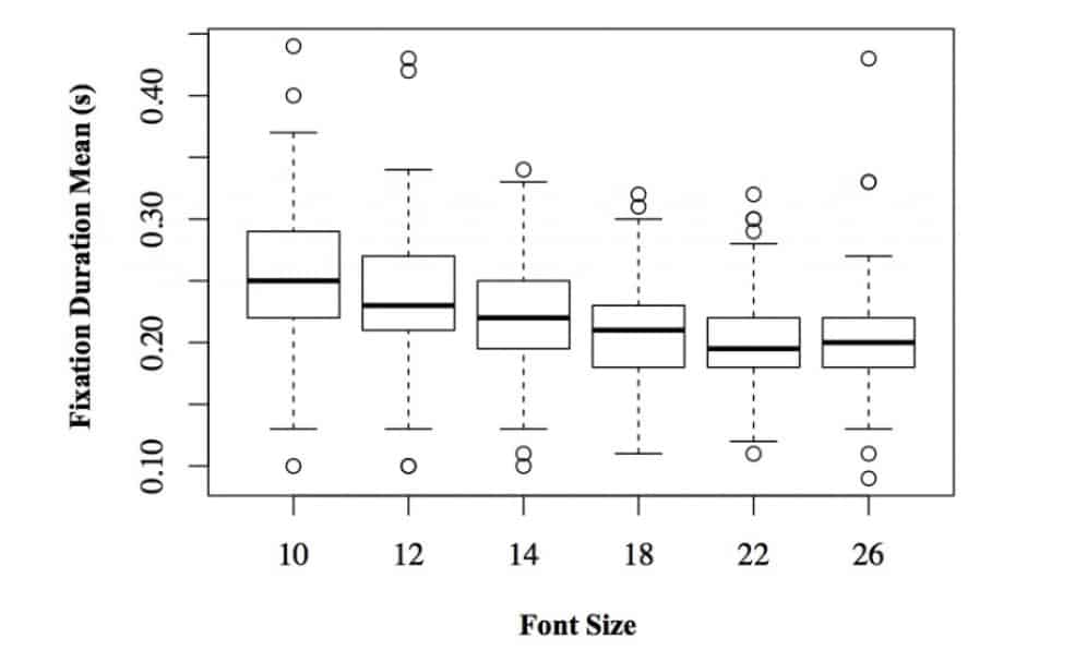
Take a look at this great article by Martin Pielot on the benefits of using larger font sizes. In the post, he shares a study that used eye-tracking software to look at “fixation duration” while reading content using different font sizes. Fixation duration looks at the amount of time that the reader’s eyes stopped at certain points in the text. The lower the fixation duration, the more consistently the reader’s eyes were moving through the text.
Here’s what the study found:

Readers stopped reading less often with larger font sizes. Size 18, 22, and 26 fonts all showed the lowest fixation duration times, with size 22 font providing the cleanest reading experience on average.
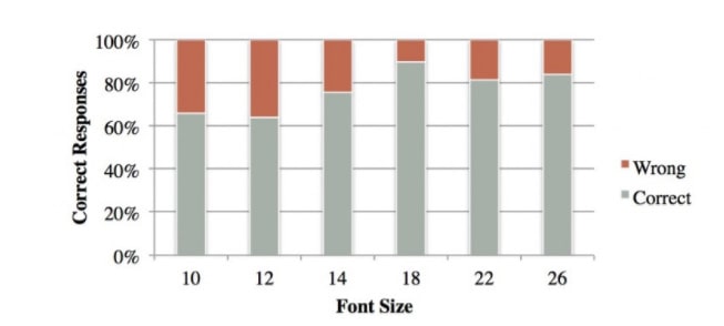
In the same study, they also tested reader’s comprehension by asking a series of questions about the text. The tests showed that larger font sizes allowed readers to absorb more information:

Similar to fixation duration, a noticeable jump was recorded at font size 18, where readers were able to retain the most information in the study.
At a certain point, it becomes a balancing act between providing users with an ideal font size and effectively using your screen real estate. If you’re in doubt, opt for 18. 18 is large enough to make reading easy for your audience on any device while not taking up too much screen real estate.
Create Intriguing and Informative Headlines
If you’re a marketer you already know the importance of headlines. A lot of focus is rightfully placed on the main headline and title. This is unarguably the most important part of any piece of content that you publish. But don’t put so much effort into choosing the right headline that you overlook the importance of every sub-headline that follows it.
When a new reader first arrives at your article, the first thing that they will do is skim through your headlines and subheadlines to gain a general understanding of the different topics that you cover. If a headline or two catches their interest, they might just take the time to go back through the whole article.
Here are a few tips for creating headlines that improve skimmability:
- Brainstorm several headlines. Whether it’s the title of your blog or your subheadlines, the first headline that you come up with is probably not going to be the best. Try brainstorming several and see what sticks.
- Use strong, authoritative language. Odds are that your audience is reading your content to learn something. Words with strong emotional implications like “hate,” “love,” and “evil,” can all pack a punch and catch attention, but should be used sparingly.
- Convey value. What are readers meant to get out of your content? What are you helping them to understand? What problem are you helping them to solve? These points should be conveyed in your headlines.
- Paint a picture. Readers love to have a picture painted for them. If a piece of content is meant to tell a story (and all content should, to some extent), then your headlines play a critical role in setting expectations for that story.
- Intrigue your audience. Headlines are a great place to ask questions. According to HubSpot, headlines that ask questions generate a 22% higher CTR.
Still, headlines are about context. Trying each of these different approaches with a different headline on the same article won’t provide a very cohesive experience for the reader. Finding the right balance is crucial.
Keep Paragraphs Short and Laser-Focused
In the last five years, we have seen a sudden rise in a particular style of writing. You’ve probably run into it everywhere—the short sentences, short paragraphs, designed-to-be-insanely-digestible style of writing.
It has been dubbed the “Neil Patel Style,” as the famous marketer was responsible for popularizing the practice.
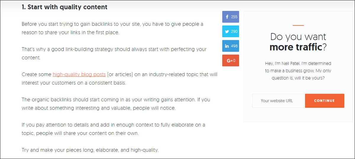
Here’s an example from his blog:

Now, he certainly takes it to the extreme. There isn’t a “paragraph” in this snippet that is longer than two sentences.
While your high school English teacher might frown at the decision to keep each paragraph so short, it is purposely designed to improve readability and skimmability.
By keeping your paragraphs short, you make each individual point easy to read and retain. This style of writing is effective for the same reasons that push readers to skim articles. They gain access to more information with a smaller time investment.
Yes, doing this will push important information farther down the page. But a few extra pulls on the mouse wheel to reach the end of the article is well worth it for the improvements in readability, comprehension, and skimmability.
Use Bullet Points and Lists Whenever Possible

If a section of your article can be broken down into a few basic points, it is almost always better to opt for a bulleted list than several paragraphs.
Bullet points are easy to skim. A reader can quickly digest the points that the section of the article was trying to make without having to dedicate much time to read it.
Bullet points are particularly helpful with content that is actionable. By breaking processes down into a series of steps, you simplify things for your audience.
Use Short Sentences, But Keep Their Length Varied
Keep your sentences short, but varied. Too many short sentences in a row can make the writing seem one dimensional. By varying the length of sentences, you keep the writing interesting and stimulating. This improves skimmability, but also makes content more interesting to read.
There are a few tools that you can use to help improve the readability of your content:
Remember that technical subjects are naturally going to produce lower readability scores. It’s about finding balance and knowing your audience.
Turn Data into Visualizations

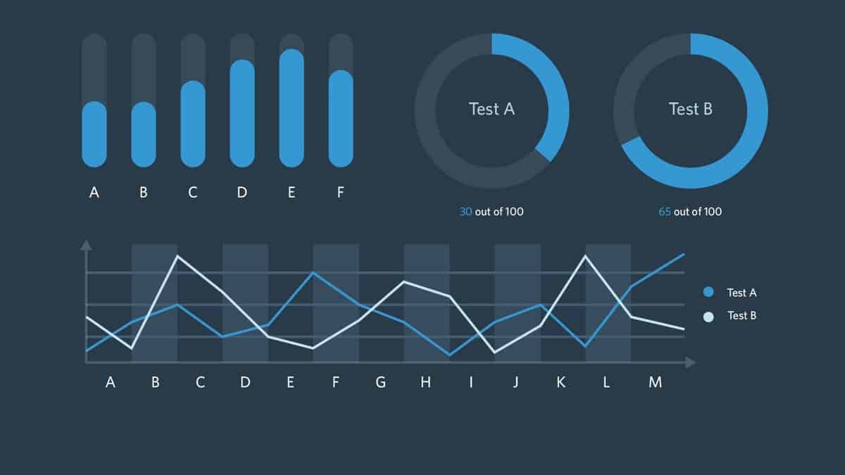
Source: Digital Telepathy
Great B2B content includes data. That data is likely to be sourced from a combination of studies, surveys, and case studies from around the web. Providing stats that back up the points that you make in your articles is a critical component of high-level content.
Unfortunately, most of your readers will never see those juicy data points if they are buried within the text. By creating accompanying graphs, charts, and plots, you make the data that you’ve spent time collecting more accessible to skimmers. By visualizing the data for your audience, you not only make the data easier to understand but increase the likelihood that they will see it.
Even better, if you can combine all of the data in a piece into an infographic, you have another valuable asset to pair with the post for visibility.
Summarize Early and Often
As a reader skims through your content, there are some natural points that they will look toward in each article to better understand the content. Both the first and last paragraph of each section are natural places to look for a summary. According to this study, users spend most of their time engaging with content above the fold and at the bottom of the page.
A majority of your readers won’t want to read an entire long-form article, but do want a reliable way to soak up the information provided in the different sections. By summarizing each major section in the final paragraph, you improve the skim-ability of the article as a whole.
Full-Length Readers are Earned
Unless you have an audience that is hanging on your every word, you can rest assured that no one opens up an article anxiously awaiting a 5,000-word wall of text. They aren’t going to dive in head-first unless they have some reason to believe that the content will be worth their time.
Most people determine that by giving the article a skim first. A skimmable article gives these readers an idea of what the article will cover, why it is important, and most importantly—how it will help them solve a problem.
The next time you write a long-form article, try something new. Have someone that has never read the article skim it from top to bottom and report back what they have learned. Or, you can try doing it yourself. It could provide some valuable insight and save you the trouble of publishing a piece that will underperform.
By ensuring that every article you publish is skimmable and conveys a few key points without further reading, you increase the chance of turning a mildly-interested observer into a prospect that reads every word.

