What is Digital Design?
In short, Digital Design is the art of customizing your emails visually to make them more engaging and attention grabbing within a cluttered inbox. Digital Design also provides you with strategies to assist you in presenting your content in a way that the reader can best digest and understand it.
Why is it Important?
Email is consistently the channel that provides the highest marketing ROI, so it would make sense to invest in this channel through digital design to ensure message is being optimally delivered to your audience. We’ve constructed the below digital design goals and accompanying strategies to not only help you create a more attractive email, but also increase engagement with your audience, and ultimately drive revenue.
Digital Design Goals
- Establish trust with your audience through the tone and style of your emails so they instantly recognize your brand
- Make your email easy to read so your audience can readily understand the purpose
- Craft your email to resonate with your target audience – grab their attention
- Pay attention to your email design to ensure it is aesthetically pleasing
Design Strategies
Layouts
A good layout allows you to visually and concisely communicate a message with your email. When considering your email layout, keep in mind responsive design, mobile optimization, readability, and modular design.
Responsive Design & Mobile Optimization
Responsive Design allows you to design an email with both the mobile and desktop views in mind, which creates a more natural experience for desktop and mobile formats. Email developers typically tend to design with a ‘mobile first’ mindset, which means they focus first on the mobile design of an email because the majority of emails are now viewed on mobile, rather than desktop.
In general, the design will expand or contract depending on the screen size of the device with which the email is being viewed. Email developers will use a specific code within the stylesheet that targets specific widths to determine how the email will be displayed. For example, if the screen is larger than 600 pixels in width, the email will display with multiple columns of content, but if the screen is smaller than 600 pixels in width, then the columns will stack one on top of the other to form one single column so everything can be easily viewed within the smaller screen.
Readability
All attempts at mobile optimization lead to one key goal: content readability. You want to structure your email so the content is quickly and easily understood by your audience. This is where the placement of your content within your email comes into play. Most of your audience is not going to read your entire email and will instead scan the email for things that interest them. You can apply certain tactics to make sure the necessary content is apparent when your email is scanned. Focus on:
- Priority Zones: Place important details of your email in the top left or top right of your email.
- Reading Patterns: People read in a “U”, ”Z”, or “F” pattern. Make sure the content of your email follows at least one of these patterns for easy readability.
- Bold Key Ideas: Use bolded or larger font on areas of importance.
- Divide Paragraphs: White space helps people focus, so including spaces between paragraphs instead of creating a wall of text can help prevent reading fatigue.
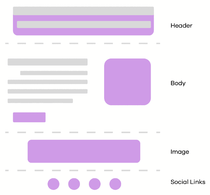
Modular Templates
Modular templates utilize a “lego” technique where each module/section has a purpose, and all of the sections come together to create the whole. It combines the benefits of the WSYWG with the ability to render emails so they appear in the inbox in the way you intended. This type of template is also very helpful for when you are sending many emails from many teams/departments because you know that your brand and style will be consistent across all sends. Another benefit is that this type of template is very easy to copy and tweak for different types of content for your brand.
Imagery and Visuals
Mobile Design
Designing for mobile is a lot more than making sure your template adapts to the screen responsively. You also should be thinking about how people navigate and consume your content on mobile. Audiences are used to scrolling now, but you do still need to consider what will appear ‘below the fold’. Below the fold is a term to describe the content of the email that does not appear on the screen when someone initially views the email, and instead appears below that content as they begin to scroll. Keeping this in mind, the more important the content, the higher you will want to place that content in the email.
Another aspect to focus on is the length/size of your email. If your email is too long or hits a certain megabyte size, it will be clipped by the inbox provider, and your audience will only be able to view the entire email if they click on the ‘view entire message’ option that appears at the bottom of the email. To help avoid clipping, you’ll want to keep your HTML light by avoiding attributes/styles if possible, using hyperlinks, removing unnecessary images, and most importantly, testing your email in your own inbox.
On the flip side, also keep in mind that images or hyperlinks are sized to be clicked on by a thumb. If a user is viewing within mobile and a hyperlink is too small, they may not be able to click the content they desire.
General Imagery & Visual Best Practices
- Inbox providers provide an ‘image off’ modes, so make sure none of the necessary content is only presented in images within your email. Also make sure buttons are coded and are not inserted as a graphic.
- JPG and PNG are the best image file types for static images
- Images should always support the text of your email
- Place tracking pixels just above the closing </body> tag within your email HTML
Fonts
Email-Safe Fonts: These are fonts or ‘typefaces’ that are preloaded onto your computer or mobile device’s memory. Examples of these are Arial, Times New Roman, and Veranda. These can be used as ‘fallback’ fonts, so if the font you intend to use is not able to be displayed, then an email-safe font displays instead. Email-safe fonts also offer almost guaranteed consistency, so if consistency is your goal, use an email-safe font within all email sends.
Web Fonts: These fonts are free or opensource fonts found on the web. The font servers are trusted sources that can be used in both websites and emails. Examples of these are fonts found in Adobe Fonts or Google Fonts. However, only a few ESP’s accept web fonts. Ironically, Gmail does not accept Google Fonts. Using web fonts also requires more extensive testing, and even then, the fonts may not appear on certain devices.
Custom Fonts: These are fonts typically provided by a client and must be uploaded to the ESP to be used. Most ESPs will accept OTF (OpenType Font) and WOFF/WOFF2 (Web Open Font Format), however you will need to keep an eye out for CORS (Cross Origin Sharing) Policies that may interfere, as these affect a fonts ability or inability to be shared across the internet. For example, a custom font may have a copyright that restricts its use. Because of this, we again strongly suggest having a fallback font available.
Font Best Practices
- Use no more than 2 types of fonts
- Font sizes should help shape the look and feel of your email
- Use bolded text and minimal text to keep the attention of your audience
- The standard body font size is 16pt
Call To Action
Primary vs Secondary CTAs
The Primary CTA is the main action you want your audience to take from the email. These should stand out within the email by using a different color, bolder text, and more surrounding white space. Secondary CTAs ask your audience to perform additional actions but are not as important the main action you want the audience to take. They still need to draw attention but will be less stylized than the Primary CTA.
CTA Best Practices
- Keep it short
- Make it bold
- Incorporate branding – refer to your brand guidelines if you’re unsure!
Accessibility
You want to make sure your emails are inclusive and can successfully engage with any member of your audience. Here are a few best practices to keep in mind when addressing your email accessibility:
- Use heading elements in code
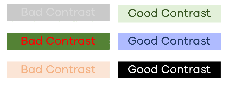
- Include sufficient contrast between text and background colors
- Provide text alternatives for images (Tip! Download a screen reader to test if your email is easily readable)
- Include meaningful link text to sufficiently explain any links included in the email
- Keep your code concise
- Use a descriptive subject line (Tip! Use a subject line tester)
Digital Design Trends
Below are a few industry trends that help to make your content more exciting and engaging, and some best practices that we suggest following when adopting these trends.
Colors
- Use hexadecimal colors
- Minimize your color scheme (3-5 colors max)
- Stick with your brand colors
Animations
- Remember, not all email clients support gifs, so make sure the first frame of your gif makes sense for your email (in case the gif does not animate)
- Limit the amount of frames within gifs so it doesn’t take too long to load
- Make sure your gifs are mobile friendly and
Kinetic Elements
- Kinetic elements are interactive content that can increase engagement
- Carousels/Sliders
- Hover-over animations
- Embedded videos
- Code all kinetic elements with CSS – NO JavaScript! JavaScript will be stripped from your email
- Remember, emails are not websites, and not all types of kinetic elements will be accepted by all inbox providers
- If you are worried about making sure you have a higher success rate of your elements working in multiple inbox providers, stick with animated gifs
Dark Mode
- Dark Mode converts emails to use a darker color palette for low-light/nighttime
- Dark Mode email is hard to code for – expect higher estimates in time & cost from developers
- All logos & icons should use transparent PNGs
- Use colors that work in both light and dark mode to help reduce the amount of changes needed when coding for Dark Mode
- Check out this article for an even deeper dive on Dark Mode!