The Power of Data Visualization in Email Marketing
The Power of Data Visualization in Email Marketing
7 minute read

When the window of opportunity to engage with a customer or prospect and pique their interest is slim, how do you avoid email irrelevance? Here’s a tip: harness the power of data visualization to analyze your customer data and create highly targeted campaigns.
Did you know that those who use advanced data visualizations are 24% more likely to achieve above-average growth? Also, they witnessed a 28% improvement in decision-making speed. Who doesn’t want to make quicker, more impactful decisions to drive growth?
But it’s not just about making better, faster data-driven decisions. What makes Adestra’s new data visualization capabilities so compelling is their ability to uncover key insights you might otherwise miss. It enables ‘train of thought’ analytics, helping you find answers to important questions like: Who are my best customers? Is there an important segment I’ve missed? And how do I increase engagement for my new product/service?
In this short read, I’ll take you through some powerful data visualizations that you can use to raise your email marketing game.
Benefits of Data Visualization
It’s no secret that the way you visualize your data can enhance your understanding and help you spot trends or anomalies that could be missed with just using traditional filtering alone.
Pivot Tables – Simple, Yet Effective
Loved by many data enthusiasts and now in Adestra! But how are they better than traditional filtering for you as an email marketer? Well, not only do pivots provide a clear, visual breakdown of your data, but they also offer a level of customization that traditional filters just can’t match. Typically, traditional filters limit you to analyzing just one or two variables at a time. However, by using a pivot table, you can cross-analyze multiple email marketing data points simultaneously. For example, you can compare open rates by time of day across different audience segments. Our pivot tables make this easy without needing to create multiple reports.
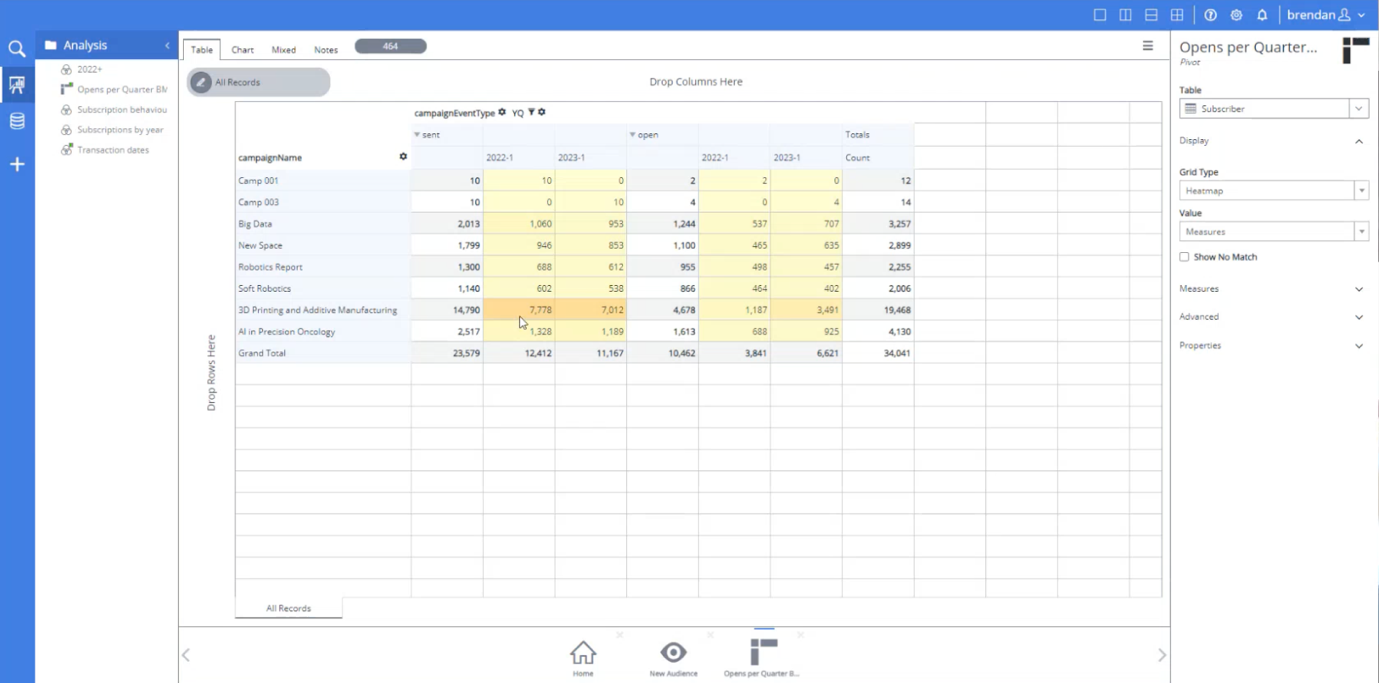
Take a look at the image below. It shows that I’ve displayed the total number of opens across all my events (email campaigns) that were sent within a specific timeframe (I choose to only compare Q1 of 2022 and 2023). What is powerful here is all the additional, or periphery, information we are being shown – that would be lost if we only used traditional filtering. Now, using this periphery data, we can see that my 3D Printing campaign tripled in opens between 2022 and 2023 – interesting!

To take it one step further – or rather, one click further – we can instantly view how many people have opened my email campaigns by adjusting the display on the right-hand panel (in next image, see “Table = Subscriber”). Easy and quick.
Overall, pivot tables transform your email data from isolated snapshots into a dynamic, interactive view – giving you deeper insights, faster analysis, and the ability to make more informed, impactful decisions. Sounds good, right?
Charts – Line, Bar, and Pie
Let’s breakdown each of these charts and how they are useful.
A line chart is great for showing how your email performance changes over time, revealing trends, growth patterns, and seasonal fluctuations. For example, you can visualize click-through rates across weeks or months to spot upward or downward trends. Tracking engagement over time in this way helps you optimize sends, refine content, and measure the long-term impact of your marketing initiatives.
A bar chart is ideal for comparing metrics across different categories at a glance. For example, quickly visualize open rates across various email campaigns to easily identify which campaigns, audience segments, or time periods are performing best – guiding future targeting strategies.
A pie chart is best for displaying proportions within a dataset. For example, they’re critical for understanding the composition of your audience, so you can focus your efforts on where they’ll have the greatest impact.
In terms of using these in Adestra, armed with the power of a single mouse-click, I can change the ‘Chart Type’ to display my email data in a line, bar, or pie chart. Easy as that. They can be used as a visual explainer or within a presentation to your team.
Now it’s up to you to decide which one to use, but know that all three of these visualizations make your email data more accessible and easier to understand. In a crowded inbox, that extra layer of clarity can be the difference between a good campaign and a great one.
Venn Diagrams – The Ultimate Power Move
You’re probably thinking: how are Venn diagrams useful for email marketers? The answer lies in their ability to simply visualize and combine data, while being easily navigable. Especially in Adestra (see image below), all you need to do is drag and drop your email data to discover and explore your data – and you might even find a new audience segment to target along the way.

All your email data is displayed on the left-hand navigation bar. Here, we’re looking at a marital status breakdown of all our subscriber base, along with gender breakdown within a given email campaign. By clicking on a datapoint, such as ‘Single’, the box at the bottom will update to show what percentage of the total subscriber base that group represents.
Let’s pause for a moment – how easy is it for you to currently view your data in this way? For some marketers, this level of data visibility wouldn’t be possible without a lot of manual effort, or assistance from a Data Analyst or IT. However, with Adestra, you can now overlap and analyze audience data yourself. This empowers you become more informed about the customer data you have and, more importantly, how to use it to create highly performing campaigns.
Here’s some other ways you could use Venns:
- Find audience intersections that might otherwise be missed, helping you uncover new targeting opportunities. Identify subscribers who’ve engaged with both lifestyle content and event-related content – ideal for cross-sell or upsell campaigns where you can create a targeted campaign to promote an upcoming event or special edition of your publication.
- Create smarter, more focused campaigns by clearly identifying audience overlaps based on their interests, preferences, and behaviors. Email marketers can set up highly targeted journeys to deliver more personalized and relevant content, driving higher engagement rates.
- By visualizing people who are both frequent clickers and have a history of purchasing high-value content, such as exclusive event tickets, you can avoid over-messaging certain subscribers while identifying high-value targets for exclusive early bird offers. As a result, you maintain their interest and loyalty, increasing the likelihood of future purchases.
The opportunity here to overlap and zoom into any intersection of your data is practically limitless.
In summary, the key to avoid email irrelevance is to visualize your data so you can better understand your audience. By understanding your audience more precisely and personalizing relevant content to them, you should not only attract more high-potential leads but also convert them. Don’t underestimate the power of data visualization in your marketing efforts – and if you use Adestra, go ask your CSM about these new features!
Final word from us at Adestra
“Adestra users can now unlock untapped opportunities within their customer data, giving marketers valuable insights to drive success and allowing them to focus on generating more demand, while driving revenue growth,” said Shawna Weaver, Senior Vice President and General Manager of Audience Engagement products at Upland Software.
We are committed to driving revenue for marketers by empowering them to turn data-driven decisions into actionable insights. We’re excited to be providing cutting-edge data capabilities that put our customers in a position to drive greater engagement. Speak to our team today, or directly with your Customer Success Manager, about how you could benefit from using Adestra’s latest range of data-driven marketing capabilities, called Audiences.