There are certain things that make content stand out. The topic, the design, the interactivity….
But while some people are under the impression that digital marketing success is completely random, Team Kapost comes from a different school of thought.
We believe there’s a rhyme and reason to producing successful content.
As such, welcome to the 5-part “Content Anatomy” series, which breaks down stand-out examples of the most popular content types. The infographics that follow look closely at the intimate components of 5 different content types, examining how these elements come together to form a complete and functional asset.
In full disclosure, we primarily use Kapost content examples to illustrate this point because we meticulously track content metrics. This helps demonstrate the power of good content in terms of lead generation and revenue opportunities.
However, our first infographic dissects a whitepaper from Google, called “Principles of Mobile Site Design: Delight Users and Drive Conversion.” Why whitepapers? Because B2B buyers rank whitepapers as the most important content type that influences their purchase decisions.
In this case, Google does an excellent job at:
The Anatomy of an Excellent Whitepaper [Infographic] by @jeanwrites
- Utilizing the entire computer screen to showcase the material
- Keeping readers engaged with short copy and lots of visuals
- Making the whitepaper scannable.
Let’s Dive Deeper
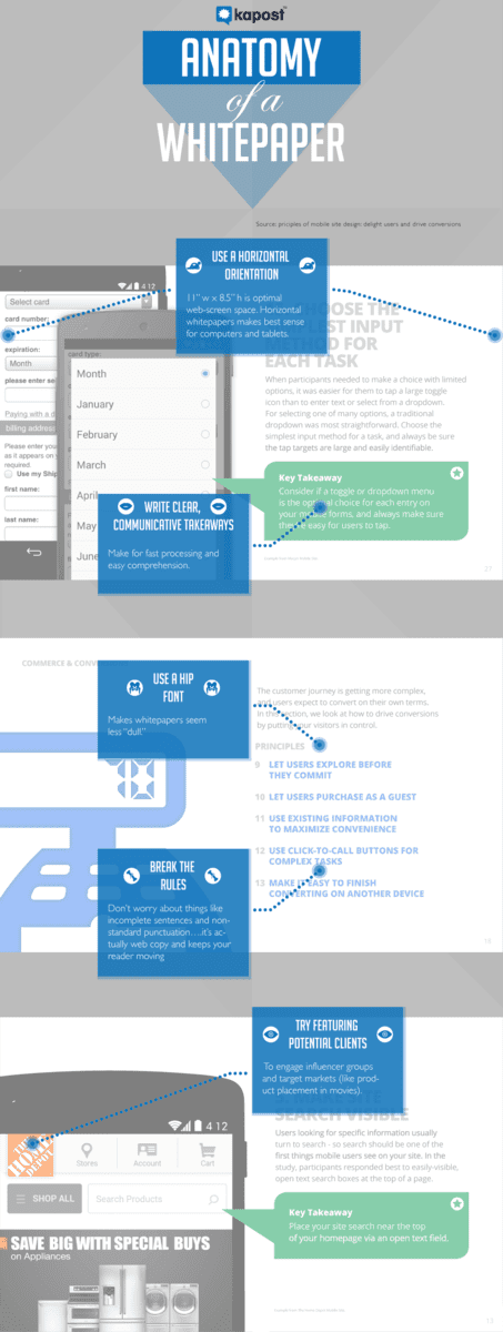
Follow the blue boxes to find out how you can replicate Google’s brilliant whitepaper architecture.

Embed the full graphic on your own website or blog by copying the code below:
To Recap
- Publish your whitepaper in horizontal orientation for optimal web-screen space. Horizontal whitepapers make sense for computers and mobile tablets.
- Write clear, communicative takeaways so that your reader can easily digest the topic, skim for important aspects, and take meaning from the piece.
- Choose a hip font. Whitepapers can seem less “dull” if you pay attention to design details like typography, spacing, and kerning.
- Break the rules. Don’t worry about things like incomplete sentences and non-standard punctuation….it’s web copy, and keeping it punchy will keep your reader moving. As Lauren Totin of Teknicks said about eBooks, “If your readers didn’t make it to the end of the eBook, you’ve missed your mark.” The same goes for whitepapers.
- Engage influencers. Don’t be afraid to feature your influencers, target markets, customers, or colleagues. Everyone likes a little ego boost.
Ready to Start Writing?
Kapost offers a comprehensive template to aid you in making your own white papers. Get started today making exceptional white papers to bring your ideas to the world.

