
Ah, the call to action.
We know that we need calls to action (CTAs), but how do we know what really works? It can be tough to tell. The teeny-tiniest, least obvious things can turn out to be the difference between a conversion and a missed connection (though I don’t recommend hitting up Craigslist afterward).
Luckily, people have been researching this for a while, trying to understand what truly compels someone to click. We also have some experience at Uberflip with successful and not-so-successful CTAs, which sheds some light on what our audience responds to.
Without further ado, here are a few things to keep in mind the next time you’re creating a CTA.
Copy

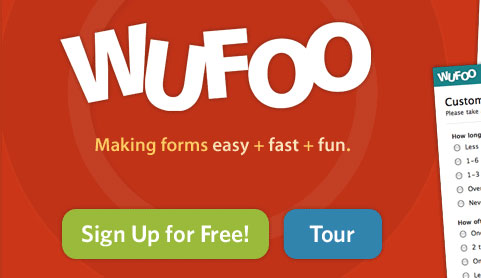
Use enticing copy to drive clicks.
We can pour over which words work best and whether a period is better than an exclamation point, but as a general rule, actionable copy that implies value is more effective than its counterparts. Positioning something around the reader (talk about “you” over “us” or “we”) and empowering them to take action with verbs like “discover,” “download,” or “get” is a lot more enticing than “submit.”
You’ll also want to play into people’s emotions when you can (not in a manipulative way, just in a “you-should-probably-click-this-right-now-just-saying” way). Create a sense of urgency with time-centric copy like “Try now” and throw in a limited time offer if you can. If there’s a purchase involved, alleviate peoples’ anxiety with a trial period or money-back offer to help get them over their initial butterflies.
Make sure each word counts—that is, stay away from jargon or phrases we’ve all heard one too many times.
Make sure each word counts—that is, stay away from jargon or phrases we’ve all heard one too many times. You want to compel people to do something, and fluffy language with no weight won’t make an impact. Here’s a great list on jargon to avoid that, while focused on longer-form writing, applies to CTA copy as well.
Design
Of course we all like looking at pretty things, but there’s more to CTA design than that. Like:
- Sizing: This one’s obvious but still needs to be said. Make it big enough to demand attention. If it’s losing to other elements on the page, the chance a prospective customer will notice it dwindles.
- Color: Use contrasting colors both in relation to the CTA’s surroundings (for example, the landing page it’s on) and within the CTA itself (the color of the button or text on its backdrop). Also keep in mind that certain colors evoke specific emotions and often carry different perceptions with them. For instance, black is associated with luxury/sophistication and red with urgency. If you’re cool with playing outside of pre-approved or brand colors, give different ones a go and see what works best for you.
- White Space: This refers to the use of negative space. Often, less is more—give your copy or the focus of your CTA some wiggle room so people will be drawn to it amidst the empty space.
- Text vs. Graphics: As HubSpot explains, people tend to read more text content than graphical content. Make sure your text is conveying the message you want, and use graphics to highlight, position, and strengthen that message.
- Shape: Softer, rounded edges work best with CTAs because deep inside our psyches is a natural drive to avoid things with sharp edges (makes sense—pointy stuff hurts). Rounded edges also pull your eyes inward instead of directing them away from your button message with pointed corners, and are apparently easier for our brains to digest. Whatever the case may be, rounded edges seem to be the preferred choice for buttons across the web.

Placement
This part can get a bit fuzzy. Many people insist that putting a CTA above the fold (visible on the page without scrolling) is key to its effectiveness. There’s logic behind this—placing your CTA below the fold is essentially hiding it, and requires your audience to put more effort into discovering it. Further to that, for ads in particular, the top right corner of the page is the best area since our eyes naturally gravitate to that spot when we first land on a page.
However, there’s also a case for below-the-fold placements. AIDA—Attention, Interest, Desire, Action—challenges the immediacy of the above-the-fold CTA based on the idea that readers want a story before they choose to take action. By guiding them through a series of steps (for instance, what your product is, what it can do for them, and how easy it is to start) before hitting them with the CTA, you have more room to woo them with your brand and put questions or concerns to rest before asking them to take action.
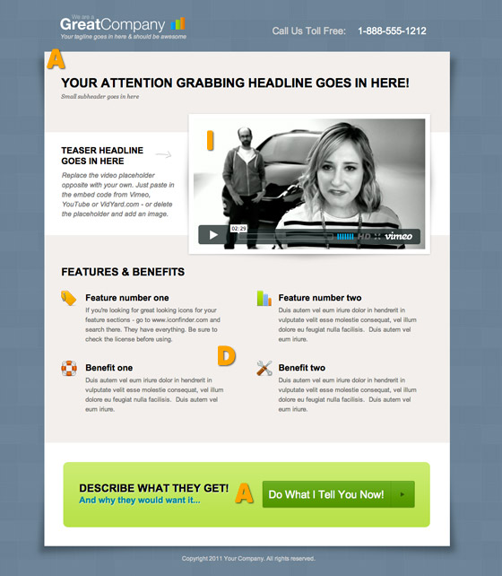
There’s really no clear answer—it depends on what you’re offering, your brand, what kind of story you have to tell, etc. Below is an example from Unbounce on what makes a good below-the-fold CTA. Check out their CTA case study for more on this and other placement options.
Relevance

Overlay CTAs increased our subscriber rate by 900%.
A CTA’s relevance takes all of the above into consideration. Its copy, design, and placement should make sense in the context of both its surroundings and who you’re speaking to. Have your message align with landing page copy or work with the topic of the blog post it’s included in. Use the space to choose design elements that help your CTA stand out. Consider who’s reading that piece of content, or which of your buyer personas you want to take action on that specific offer—will the CTA resonate with them, or are you throwing them a generic ask that will fall flat?
Here’s an example from the Uberflip files: Prior to a couple of months ago, our blog subscriber rate was laughable (though we weren’t really laughing about it). We had CTAs placed in and beside the blog posts themselves asking readers to subscribe but people just weren’t biting. Then we came out with Overlay CTAs—a fancy term for pop-ups—and were able to experiment.
In only a month, our subscriber rate increased by 900 percent and continues to show steady growth.
All we did was set a CTA to pop up 60 seconds after someone had started reading a blog piece asking them to subscribe. It was hard to ignore, but also let them see the value in our content before asking them to sign up for more. If they didn’t want to, they could dismiss the CTA, and wouldn’t see it again on any of our blog pieces for a week. In only a month, our subscriber rate increased by 900% and continues to show steady growth. Simply fixing the CTA to stand out more and taking our readers’ experience into account made a huge difference in our conversion rate.
Testing
Ok, don’t be mad at me.
But here’s the part where I say that, although the above points will help make your CTAs more effective, no one knows for sure what really works. Because there’s no one-size-fits-all answer—and there are new tactics tried all the time that help us discover what gets people clicking.
As with everything content marketing, testing is essential to dig into what works and what doesn’t so you can optimize your CTA within the context of your website, landing page, email, blog post, and so on. At Uberflip, we measure each CTA’s performance through the metrics dashboard in our Hub, but there are many ways you can track their success (Optimizely is a great A/B testing software, if you’re in the market).
While I’d love to say that following these tips will guarantee a conversion bonanza, I’d be lying. But what I can leave you with is this:
Give these tips a go. Test different stuff. Iterate accordingly…
Then come back here and let us know your secrets.