The time for reflection is here. As marketers, we’re digging into the data, dusting off our 2014 goals, reviewing our Twitter and Facebook feeds, and reliving the past 12 months in all its glorious triumphs and failed experiments.
And many are tapping into the end-of-year nostalgia by creating captivating interactive content experiences.
In fact, we created one of our own, showcasing the best brands in content marketing.
But as marketers flooded our inboxes with year-end content, there were a few brands that blew us away. Here are three of my favorite examples.
1. Spotify’s Year in Music
Serving up data about your users, to your users, is an amazing way to pull people into your content. It’s personalization done perfectly. And Spotify killed it this year with their “Year in Music” campaign.
First, I received an email with the subject line “Your Year in Music.” Inside was a perfectly simple, visual design with my top song of the year (#EllieGouldingFTW). Then, they requested I take a single step: “Check out the rest of your Year in Music now” — a, bold, enticing call to action.
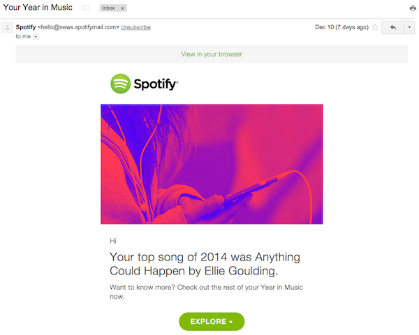
Why yes, Spotify. I think I will explore.
And I wasn’t disappointed when I clicked through. Spotify sliced and diced data from 2014 to create a stunning content experience, full of interesting stats about music consumed on their platform worldwide.
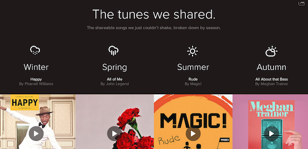
But it didn’t stop there.
They continued to engage me as I traveled down a rabbit hole of amazing, more personalized content. At the end of the Year in Music interactive page, they asked me:
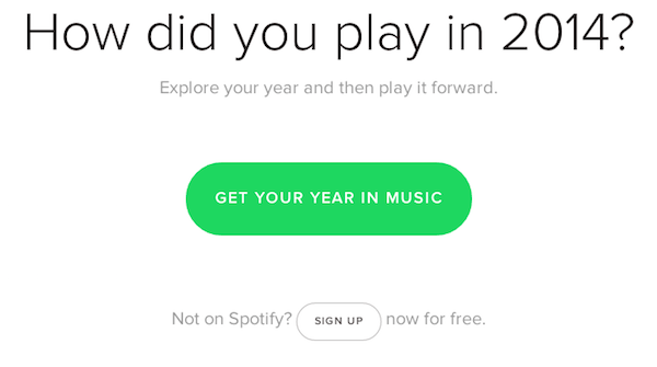
Again, when I clicked, Spotify didn’t disappoint. It showed me tailored information based on my own listening habits, including:
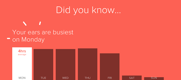
This was a very cool campaign, making use of data to personalize a content experience and engage users for long periods of time.
Well done, Spotify.
2. Twitter’s #YearInReview2014
What were people talking about this year? What moments made the world take notice and share their thoughts in 140 characters and hashtags? Twitter can tell you.
In a great campaign that looks back over the major moments of 2014—from the happy to the horrifying, the timeless and the temporary—Twitter pulls data and images to create an overview of the most tweeted about topics, organized by hashtag and month.
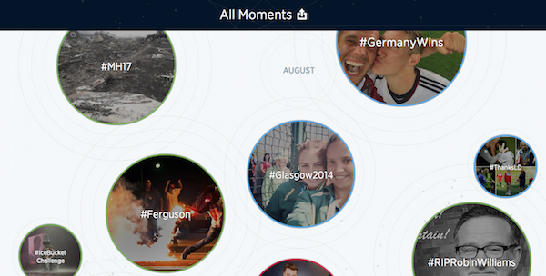
You can click in to see curated top tweets from each of these events, followed by a call to action to “Explore now,” which redirects the user to Twitter, showing a larger list of tweets and images.
Again, a great example of a content experience that keeps users engaged, and provides additional content to explore based on interests that resonate.
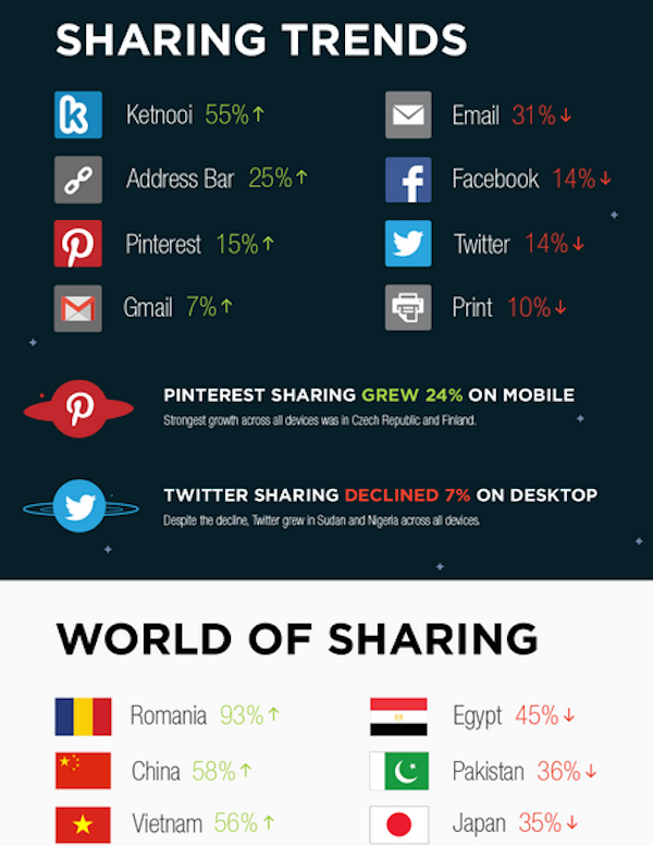
3. AddThis’ 2014 Year in Review [Infographic]: How Social Media Fueled Social Action
Presenting data in fun and interesting ways always get my attention. And AddThis has done just that with their awesome infographic.
Social media—how its used, what platforms are used, where its used—differs country by country, and it’s fascinating to see just how specific trends or platforms impact marketing across the globe.
The infographic, like Twitter’s end-of-the-year content, gives us an idea of what topics captured the minds of people all over the world. But it doesn’t stop there. It also links social media to inspired action, which takes this online data off the computer or phone into “real life.”