Below is a tour of Kapost’s new look, which will debut in Beta later this summer. You will have the option to turn this view on or off, and we plan on using the next couple months to gather your feedback and continue to make Kapost the optimal tool for your content marketing efforts.
Let us begin!
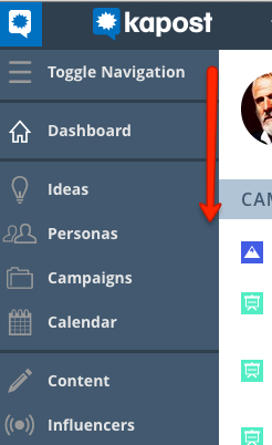
To start, we have a new navigation bar located on the left hand side of your instance. The button at the top, labeled “Toggle Navigation,” allows you to see more or less detail on the navigation bar. This navigation bar will replace the navigation you now see across the top of your instance.
The first menu on the navigation bar is the Home Dashboard.
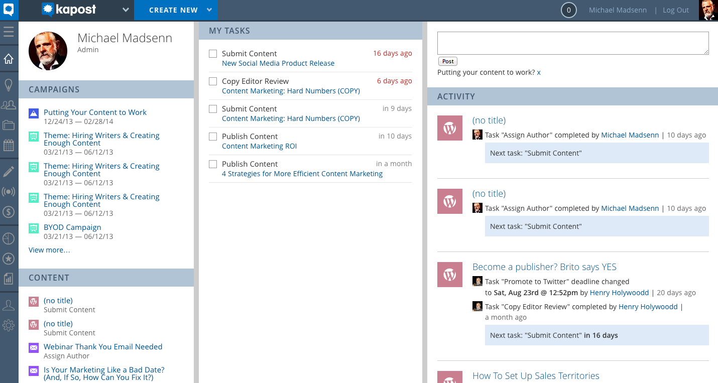
The first column contains a snippet of personal information as well as a list of content and campaigns you are in some way responsible for. At the very bottom, you will see a list of content recently viewed by you, the user. The second column shows all of the individual tasks you own, and the last column shows a record of your instance’s activity, as well as a field for posting comments, updates, and statuses.
Next, let’s hop over to our new Content Catalog. At first glance, you can see the improvements we have made to the overall appearance. If we did deeper, you will see some of our user interface changes designed to improve your experience navigating through your content.
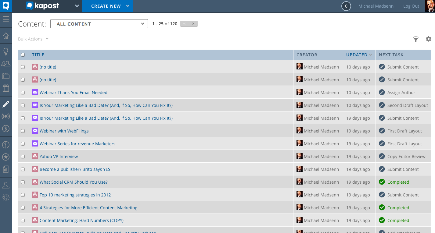
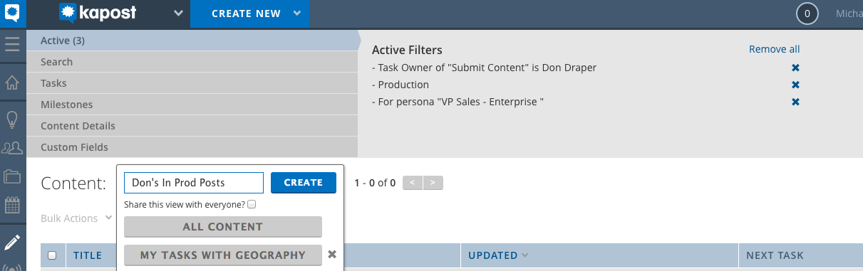
On the far right, you will notice a funnel icon – this is the new filters button. If you click on it, your filters are made available at the top, and you can sift through them and choose the exact filters you need to effectively narrow down your content.
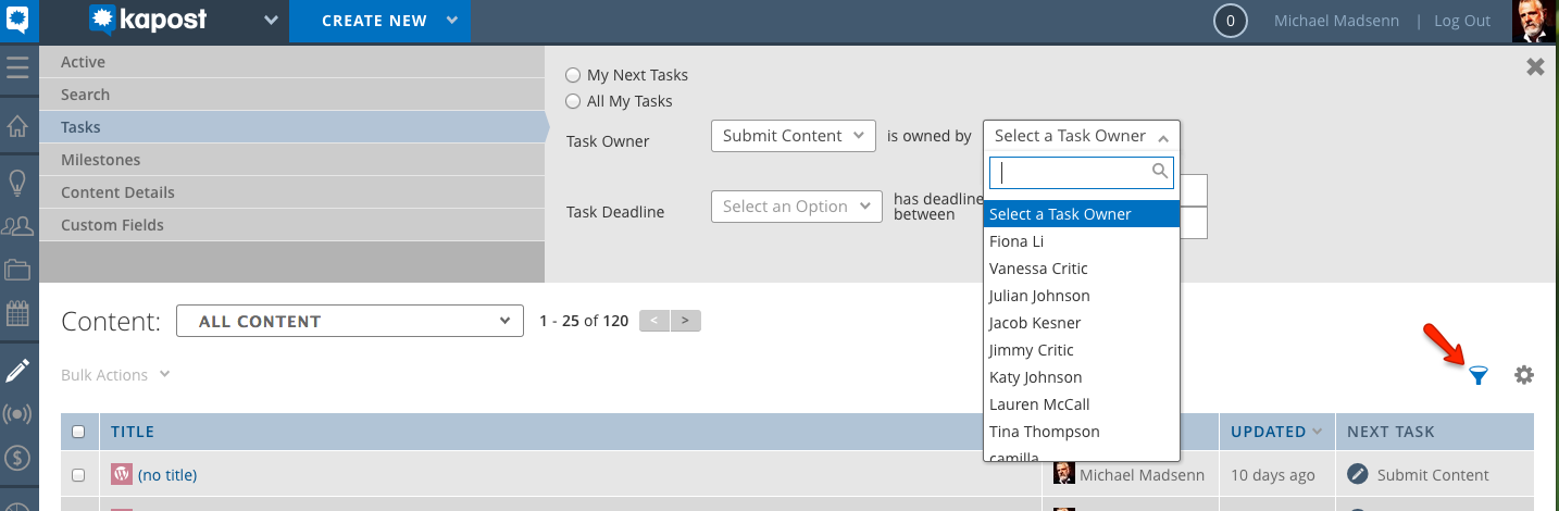
If you create a view using your filters that you know will be useful to you again, you can name it and save it as a view using our new view creation tool at the top of the page. This saved view is a new enhancement, and will be personalized to the individual user.
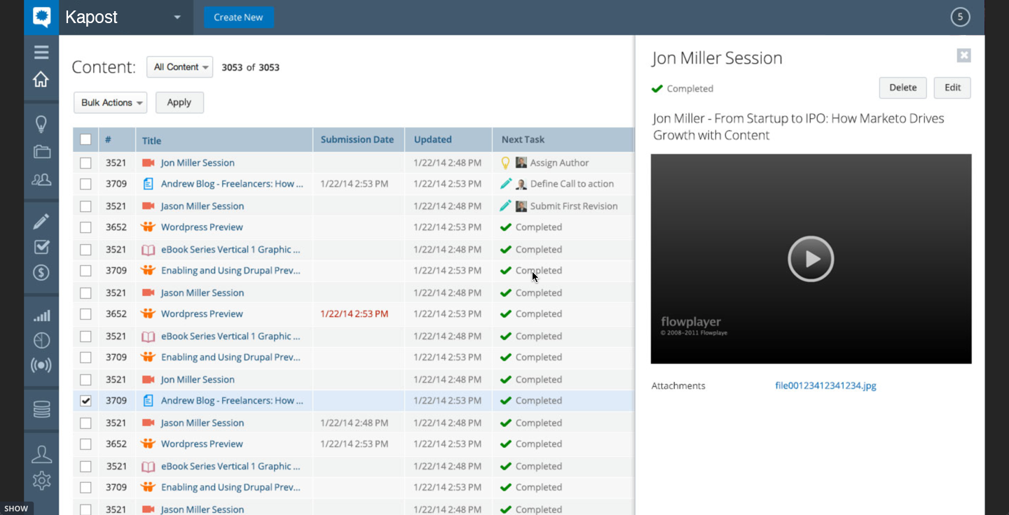
One of our most exciting new changes is the ability to preview your content by dragging your mouse over it – this allows you to see at a glance the details of the content in your list.
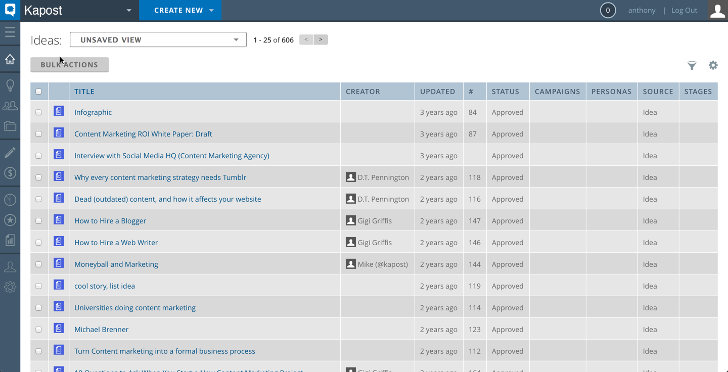
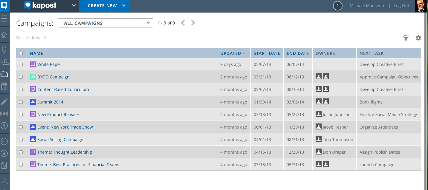
You will see many of the same changes that we just explored on the new Content Catalog in both Campaigns and Ideas – new filters, saving views, and a more user-friendly look. You can see previews of both below:
What’s Next:
You will have the option to turn on the new UI so that you can learn it on your own time and without it impacting your workflow. If you would like to try it out please contact your Customer Success Manager or email the support department at support at kapost dot com. We will also make training videos and documents available to guide you through the new UI once it is released.
As we are nearing our official release date for the Beta version of this update, we would love to hear feedback directly from our users. If you would be interested in trying out our new look in the coming weeks, please let us know. This will be a great way to help us tailor Kapost to better suit your needs. Feel free to email your questions or comments to support at kapost dot com or contact your Customer Success Manager directly.
Update: Read on for Part II, The Calendar!