While installs aren’t everything (in truth, they’re just the starting point), they’re essential for boosting your user base and beginning your journey to app success. We like to think of them as the first step towards app domination.
App ads comes in all kinds of shapes, sizes, and styles, but today, we’re focusing on user acquisition ads with the sole goal of driving installs.
So, what makes an exceptional app ad, and what elements are essential to achieving your goal of increasing installs? Let’s take a look at seven real-life examples and examine what makes them successful and what key techniques you can learn from them.
1. ZipCar – Facebook App Ad
This app install ad from Zipcar appears in the Facebook app’s news feed, blending seamlessly with the natural, organic posts that surround it.
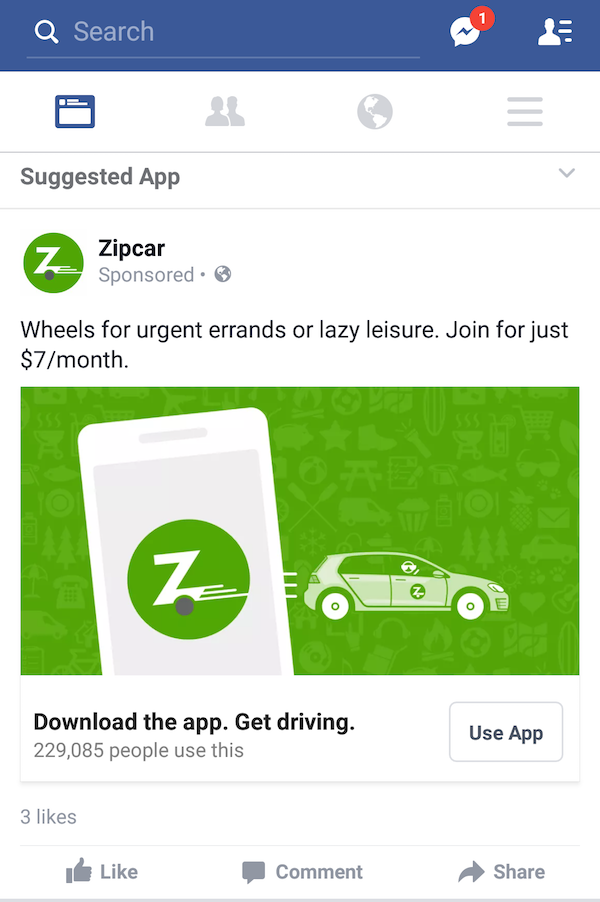
Zipcar does a great job of using an eye-catching illustration to draw the user’s attention, along with concise, to-the-point copy with a clear CTA button, “Use App.”
Zipcar uses the top ad copy to highlight the benefits of Zipcar and uses the bottom ad copy to zone in on the desired conversion task while still managing to highlight Zipcar’s value.
What works well:
- Blends with organic Facebook posts, creating subtle advertising.
- Uses familiar brand colors and incorporates a colorful, eye-catching illustration.
- Drives home the CTA with ad copy and relevant button text.
- Upfront about pricing – this app install ad highlights the brand’s affordable price point.
- Social proof is incorporated with the “229,085 people use this” line, boosting the app’s credibility.
- Specifically targets users who are not Zipcar members, allowing the ad to use tailored text that focuses on new, rather than existing, members.
2. Hotels.Com – Twitter App Ad
This app ad from Hotels.com is found amid a crowded Twitter feed. As with the other social media examples, Twitter’s sponsored tweets use native designs, allowing the advertisements to blend in with the organic Twitter posts.
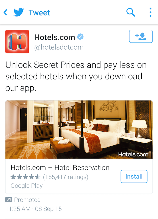
This ad for Hotels.com’s app features a large, bright banner image showing a welcoming hotel room, conjuring dreams of vacations and getaways.
The copy does a great job of articulating value without overdoing the copy. Secret prices and “paying less” sound like enough to win over most deal-hunting hotel hounds.
This is another app ad that makes use of social proof, showing the app’s impressive rating and the number of users who have already downloaded the app. This integration is fantastic if your app is well-rated in the app store but can have the opposite impact if your stars aren’t as stellar. So, make sure you’re doing everything in your power to boost your app store rating.
Once again, we’re being treated to a clear “Install” CTA that makes it obvious we’re downloading an app, not visiting an external website.
What works well:
- Ad uses a native design that allows the app ad to blend with the natural Twitter feed and not feel obtrusive.
- Uses a bright, relevant image to appear within the Twitter ad that clearly encapsulates the brand.
- Focuses on app value with limited copy to highlight main benefits.
- Showcases social proof with a great app rating and a high number of user installs.
- The Twitter follow button allows users to easily connect with the brand, helping Hotels.com grow their social reach while also earning new users.
3. BillGuard – In-App Ad
This BillGuard app ad is a great example of smart audience targeting.
BillGuard is an app that allows users to track and manage their finances. They’re seeking users who are smart spenders and care about tracking their spending. To attract those users, BillGuard placed ads in a complementary app, Slickdeals – a deal-discovery app.
This is an easy way for BillGuard to tap into Slickdeals’ user base because they mirror the types of users BillGuard want to attract.
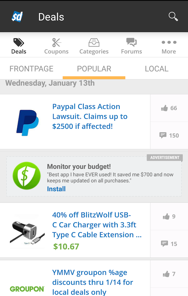
A unique aspect of this in-app ad is that BuildGard doesn’t include their name in their advert.
It’s a risky move, but one that could pay off, especially for smaller, unknown brands, as knowing your app’s name might not make much of a difference to users. Instead, the minimal ad copy space is used to communicate the app’s value via a user testimonial.
This user testimonial is cleverly worded, detailing the app’s value, while also highlighting a powerful review from a real user to encourage app installs.
What works well:
- Effective audience targeting – the BillGuard app install ad appears inside another savings-related app, which mirrors BillGuard’s target audience
- Includes a user testimonial to serve as a powerful endorsement while also detailing the app’s main benefit.
- Sacrifices app name to highlight value. This strategy won’t work for everyone, and might negatively impact brand recall, but for small apps where value proposition is more important and their brand name is relatively unknown, this could be an effective strategy.
- Native placement allows the ad to fit with the design of the app without interrupting the user experience.
4. Abs Workout – Pop-Up Ad
This pop-up ad for Abs Workout appears as the user is exiting a fitness app.
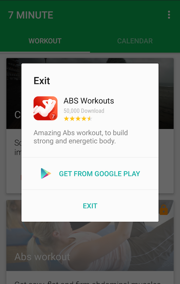
The Abs Workout app is a great fit for fitness-focused users who are already using the 7 Minute Workout app. To further drive this message to their potential users, Abs Workout use social proof in their ad by including their high star rating and the “50,000 Downloads” copy.
Instead of the “Install” CTA, we see a “Get From Google Play” call-to-action, which can be just as effective. However, businesses using this CTA need to ensure that the app store included in the CTA matches the one available to the user. If you tell an Apple user to download your app from the Google Play store, you’ll likely annoy your potential user and deter them from installing.
What works well:
- Caters to target user base by displaying its app advertisement in a related fitness app.
- Makes use of timing to launch the app ad when, presumably, the user has completed an existing workout, enticing them with a new challenge while they’re in the workout mood.
- Displays social proof with the use of high star rating and download numbers.
- Uses an ultra-specific CTA, naming the specific app store for the user. However, a high level of personalization will be required to ensure brands don’t direct people to the wrong app store
5. Pokemon Shuffle – Instagram App Ad
This app ad for Pokemon Shuffle appears on an Instagram feed.
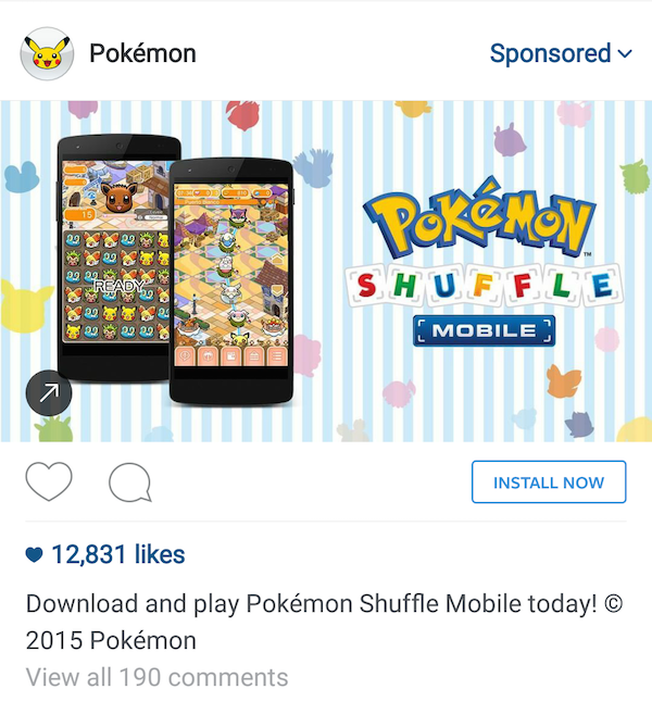
As discussed in our ‘How to get incredible app installs with Instagram ads’ blog post, app install ads are a great option for brands because they blend well with Instagram’s visual feed.
The screenshots within the ad show what the game looks like, allowing users to get a sneak preview of what they can expect from the download. Thanks to Instagram’s collection of app-oriented CTA buttons, this Pokemon game uses the “Install Now” button to direct Pokemon enthusiasts straight to the mobile game.
What works well:
- Ad fits naturally into Instagram’s feed, providing unobtrusive advertising.
- Screenshots give a taste of the app, so users can see what the app will look like and what they can expect.
- A clear CTA makes use of the “Install Now” button text.
- App ad is full width and allows for engagement through Instagram’s like and commenting options, helping foster good brand relationships while simultaneously advertising the app.
6. Audible – Banner App Ad
This ad from Audible is a great example of a banner ad which appeared at the top of the screen within the Podkicker podcasting app.
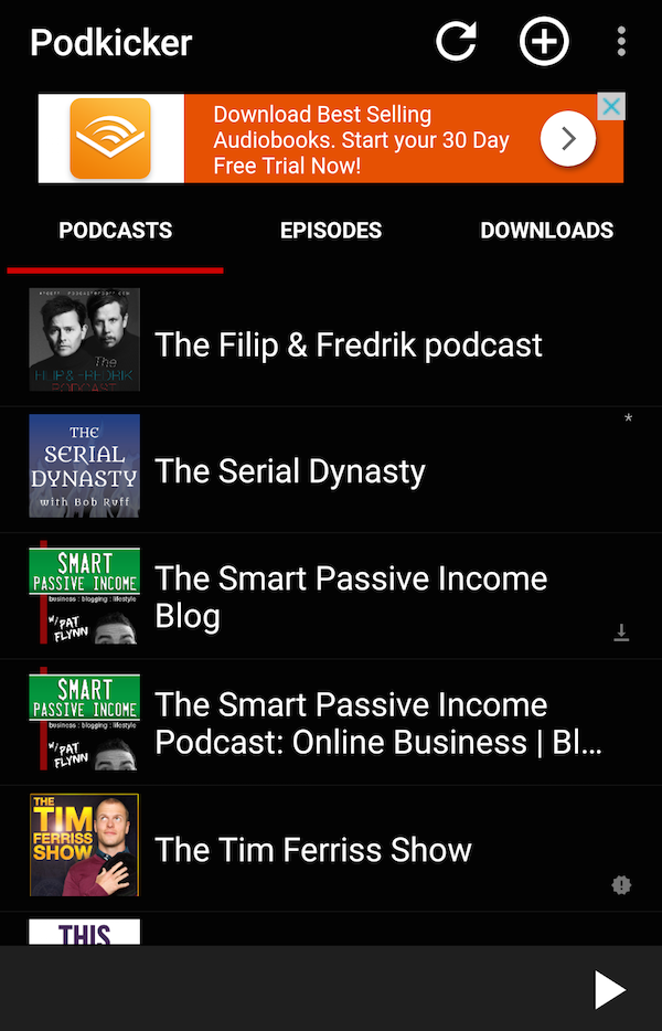
Audible focuses on the 30-day free trial as a call-to-action. As opposed to the traditional “Install Now” CTA that we’ve seen in previous examples, Audible uses an arrow button that tells users they will be taken to another app to access their downloadable audiobooks.
The location of this ad is also a winner for Audible. By placing an ad for an audiobook app within a podcast management app, it’s likely to attract a high level of relevant users, increasing its potential ROI.
What works well:
- Targets a specific app with similar demographics and interests to attract the right audience.
- Highlights the 30-day trial to push value to hesitant users.
- Arrow button tells users they will be taken to another screen (in this case, Google Play Store) to download the app.
- Not overly intrusive and doesn’t compromise the app experience.
- Bright color helps the ad stand out.
7. TurboTax – Banner App Ad
Found within the Zedge app, this install ad for the TurboTax app appears as a banner at the bottom of the screen.
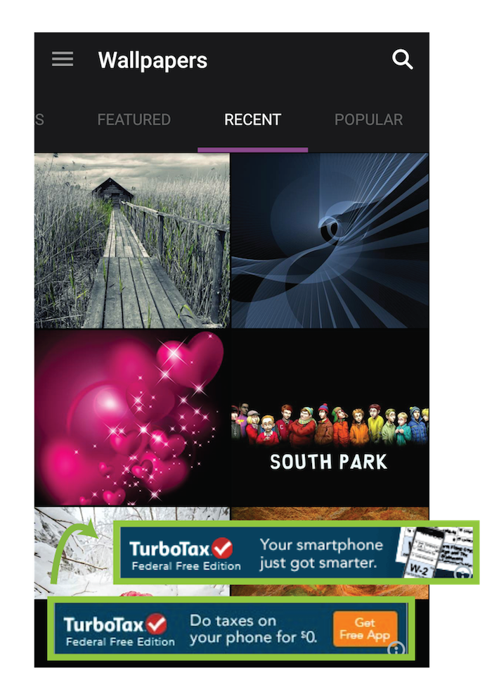
The inclusion of TurboTax’s logo provides instant brand recognition, while the CTA button is difficult to ignore.
This dynamic ad has dual messaging as it switches between banners. The first focuses on the value offered from the app, while the second reiterates how users can use the app to complete the task in question.
What works well:
- Rotating message allows the app ad to display two sets of copy.
- The bright rectangle with a targeted “Get Free App” CTA entices users to click through.
- Incorporates a recognizable logo into the banner ad.
- Includes a small image showing how to use the app.
The requirements for an effective app ad
To help ensure you get the most from your app ad, here’s a simple checklist you can follow when creating your ad, taking inspiration from the 7 examples we’ve examined in this blog post:
- Broadcast your brand. If you’re a well-known brand, incorporate your logo or other iconic brand images into your ad for instant recognition.
- Concentrate on your call-to-action. Craft a powerful, targeted CTA that uses specific, app-related language (such as “install”).
- Make use of multiple messages. Try rotating text to show users multiple messages, giving you more space to encourage installs.
- Include screenshots where Possible. Images give users insight into how your app works and what they can expect. Furthermore, humans are naturally drawn to images, so incorporating them in your ad improves your chances of getting noticed.
- Don’t forget your social proof. Consider incorporating social proof into your app ad copy through star ratings, download numbers, or even word-of-mouth user testimonials.
- Appear where your audience hangs out. Make sure that your app install ads are displayed on apps or platforms with similar demographics and relevant audiences. This will improve your targeting and save money. Apps can work with specific mobile ad networks to ensure that their app ads are well placed.
- Consider the value of various channels. Different advertising channels will have their own advantages and perks. For example, Instagram and Facebook ads have ability to target users based on their specific interests. Twitter allows for the potential to bring in new followers, in addition to installs. App owners should test out a variety of channels and then evaluate the effectiveness of each to determine which channels brought in the most installs and the most engaged, high-retention users.
- Tune in with your target audience. Understanding your target audience is crucial when creating content and designing your app ad. Without this knowledge, you’ll struggle to create an ad that resonates with your audience.
If you’d like to find out more about how Upland Localytics’ mobile app marketing software can help transform your mobile app marketing potential, request your personalized demo today.
