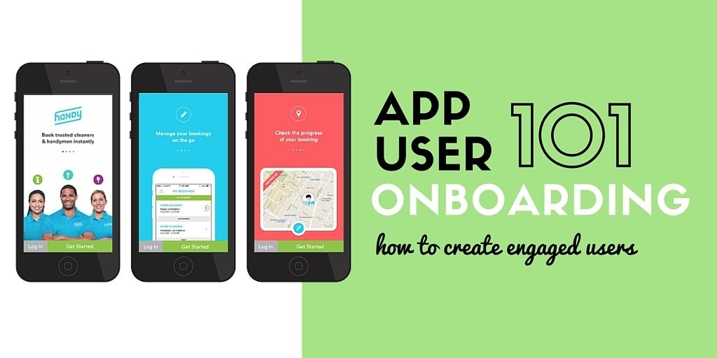
Note: This post was originally published in April 2016, but has been updated with new onboarding examples.
App onboarding is key for one core reason: if users don’t understand your app, they won’t use it.
The onboarding process is a user’s first impression of your app, and when designed correctly, increases the likelihood of successful adoption. When a user launches your app for the first time, the onboarding process reinforces your app’s value and provides instructions that highlight key benefits and features. A strong onboarding process is essential to your app’s success – in a case study conducted with Slice, we found that retention rates went up 50% after implementing a solid onboarding process.
When done well, app onboarding helps build strong relationships with users. If done poorly (or ignored altogether), you risk users never understanding how to use your app thus having a negative experience and possibly abandoning your app for good.
But what exactly are the components of a great app onboarding experience? We’ve highlighted 7 app onboarding best practices below, complete with onboarding designs and post-onboarding education tips that are guaranteed to keep your users happy, educated, and coming back for more.
7 App Onboarding Best Practices
1. Emphasize Your Value Proposition
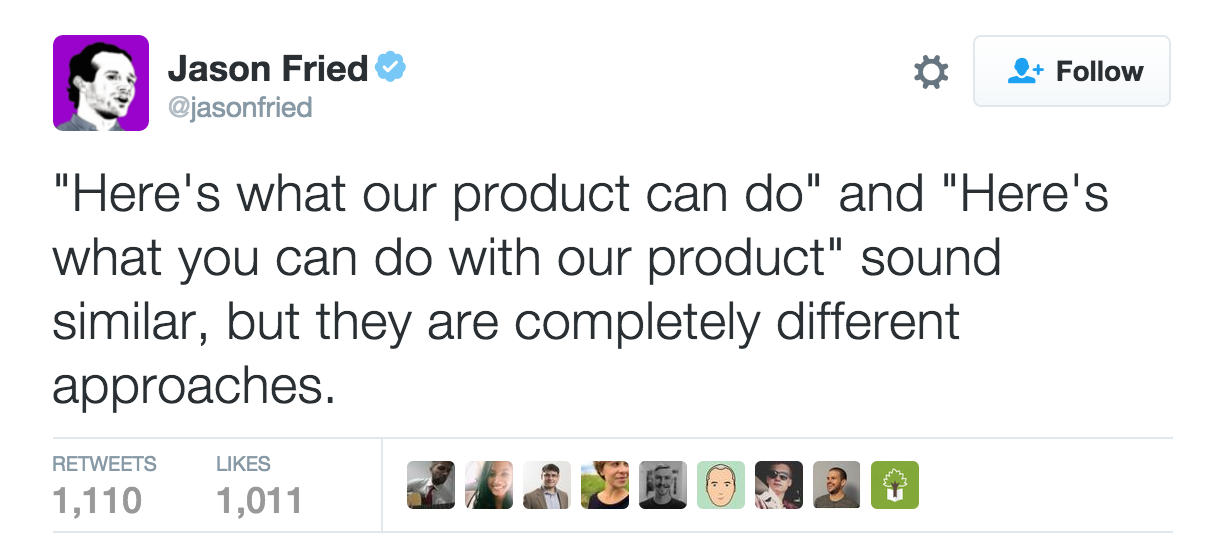
Many apps make the mistake of telling users about the bells and whistles of their app rather than showing users how their app can change the user’s life for the better.
People don’t care about features – they care about what they can do with those features. Always lead with the value of your app.
GasBuddy, a mobile app that allows its users to compare gas prices while traveling, informs users upfront that the app can be used to help fuel their journey by offering real time reviews.
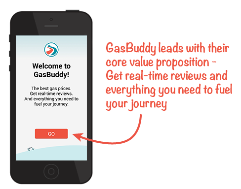
Exciting features and impressive functionality are important, but showing users just what they can do with those features, e.g. your value proposition, will win them over long term.
Jason Fried of Basecamp says it best:
2. Highlight Core Features
While your app’s value should always be the first focus of onboarding, users still need to understand the key functionality of your app. Show users the key features of your app that will help them complete a desired task by utilizing callouts and highlighting key buttons.
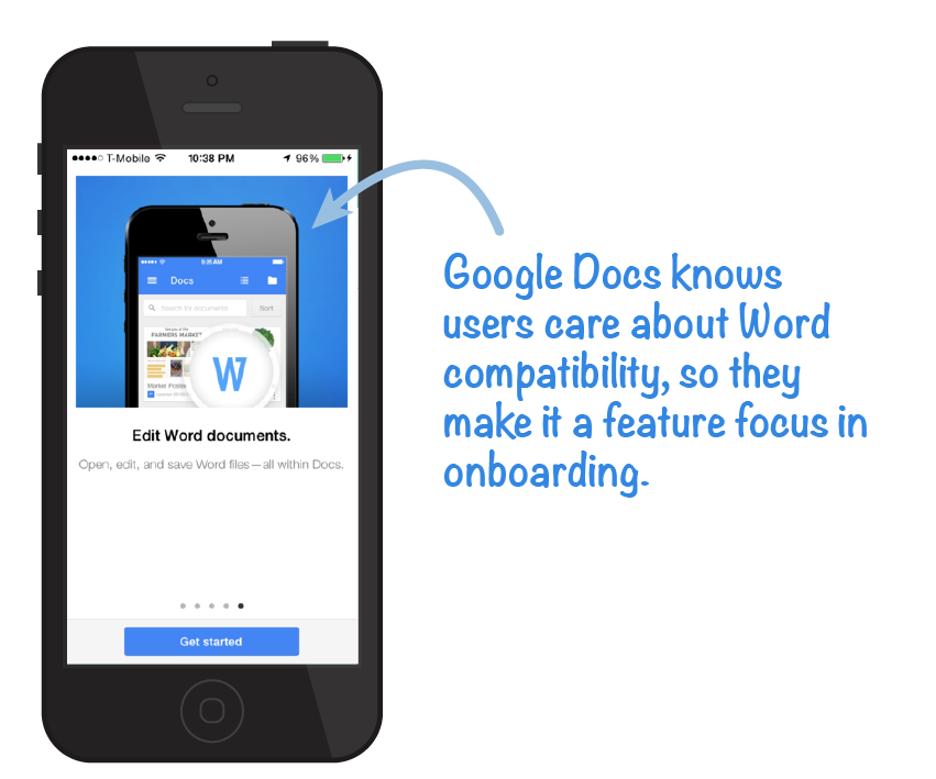
Remember, you don’t need to throw in the kitchen sink when onboarding – just stick to a few of your most important features. You can always showcase less essential (but still really cool) features later on during a user’s 2nd, 3rd, or 4th app launch. Apps can easily introduce these additional features through the use of in-app messages.
3. Only Ask For What You Need
Many apps require data access or messaging permissions in order to provide the best experience and value. You’ll need to ask users to grant your app access to this data through the use of permission requests.
When certain data is essential for key app functionality, be sure to ask for access. However, it’s very important not to bombard users with permission requests at the start of the app onboarding process. Studies show that 60% of users say they have chosen not to install an app after discovering how much personal information the app asked for.
The best way to avoid makes users jumpy is to only ask for the essential permissions up front – nothing else. Make it clear to users exactly why you’re asking for access to certain areas of their phone and explain how that information is important for getting value out of your app. Save the ‘nice to have’ permissions for when the user is more engaged with your app.
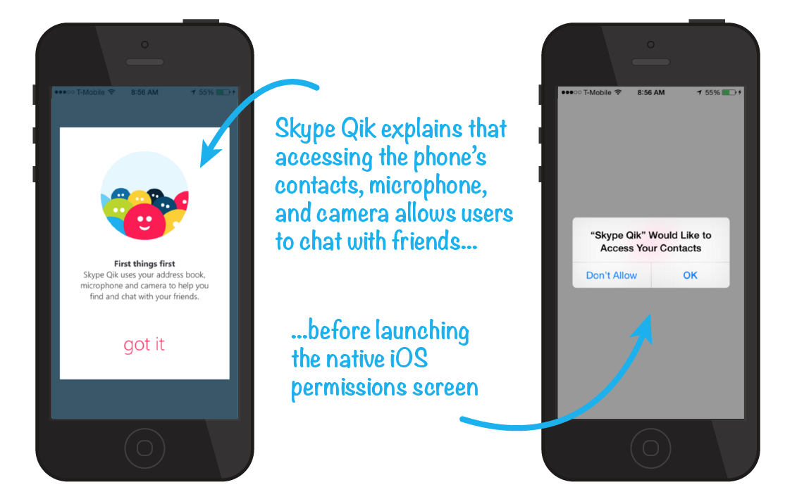
Skype Qik makes sure to explain why access to a user’s contacts, microphone, and camera will make the app experience better before launching the iOS permission request.
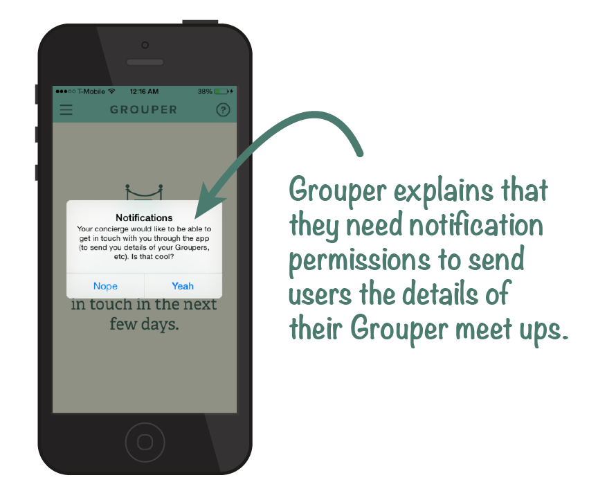
Grouper does the same, explaining to users that enabling notifications will allow the app to send details about upcoming Grouper dates. To better understand how and when to launch permission requests, read our post detailing how to get users to agree to push notification permissions.
Here are more tips on how to ask for access to more app user data from your users.
4. Don’t Overwhelm Users & Keep It Quick
Prioritize your app onboarding experience and stick to the basics – you don’t want users being forced to swipe through a dozen screens before they can get into your app!
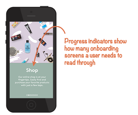
Avoid text-heavy explanations and opt instead for app screenshots and illustrations to get your point across. You’ll also want to make sure you stick to one feature explanation per screen so that you don’t overwhelm users. It’s also smart to incorporate progress indicators into your onboarding process.
Progress indicators often come in the form of small circles or parallax images that give the user a sense of movement and build-up. These indicators allow users to get their bearings within your onboarding process, helping them understand if they are near the beginning, middle, or end of your introduction.
Birchbox, a company that specializes in monthly subscription boxes, uses onboarding to show users what they can do within the app without overwhelming them with heavy text and abundant screens.
5. Avoid the Obvious
Good app onboarding is efficient and to the point. You want to keep the onboarding process as quick and streamlined as possible, which means trimming off any unnecessary fat.
Don’t waste time stating the obvious. App users know that a camera icon will bring up their native camera, and most users will naturally understand the kind of icons associated with liking, favoriting, and sharing, so long as your icons aren’t far off the mark.
In many cases, explaining an app’s navigation structure is largely unnecessary, so long as you aren’t deviating from a standard design.
6. Make it Easy to Sign Up
Signing up can often be a barrier to app adoption, so you should always make the signup process fast, simple, and easy.
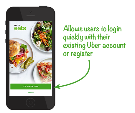
When possible, always give users the option to sign in to your app through existing social media accounts like Facebook, Twitter, or Google. Not only do social options provide a one or two click avenue for signing in, but they can also build trust in the mind of a user.
To optimize your app user onboarding process, test with various login options – do more users prefer to sign up via social or with their email address? Do users prefer to social sign up with Twitter or Facebook? What about getting rid of a sign up option all together?
You will also want to experiment with timing. Some apps have more success asking users to sign up at the end of the onboarding process, while other apps prefer to ask users to sign in immediately when they launch the app for the first time, before onboarding even begins.
7. End With a CTA
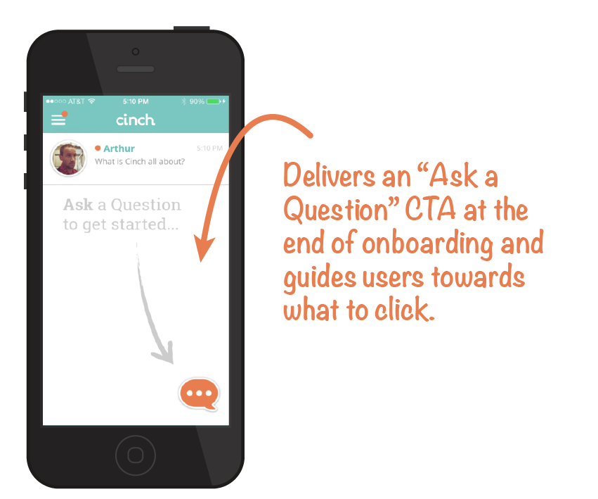
Consider including a direct call-to-action at the end of your onboarding experience so that users have a direct next step to take. Getting users immediately involved in your app helps them continue to grow as engaged users and allows them to get excited about your app.
Cinch exemplifies this practice perfectly, telling users to “ask a question” following onboarding.
App Onboarding Design
There are a few different onboarding styles apps choose to use when getting users up to speed.
Popular designs include:
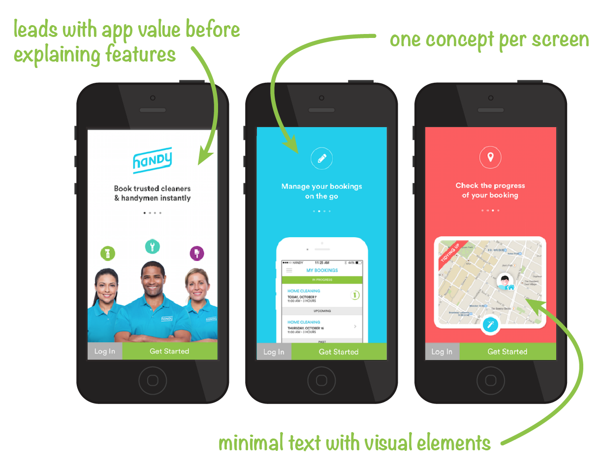
Coach Screens. Coach screens are app screens that introduce value and key features. Users swipe through the screen to progress through the onboarding experience. When using coach screens, focus on one concept per screen and be sure to avoid too much visual noise.
Handy does a great job using coach screens for their app onboarding process.
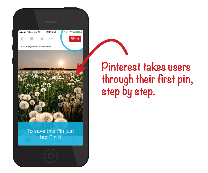
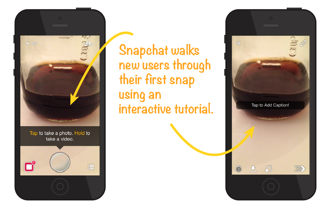
Interactive Tutorials. Interactive onboarding follows the “show rather than tell” method of app onboarding. Rather than explanatory screens a user swipes through, interactive tutorials guide users through completing certain tasks that will help them understand how your app functions. Interactive onboarding is especially valuable for apps with complicated workflows and for gesture-based apps.
Below, Pinterest guides users click by click to show them how to share their first pin.
Snapchat is another app that incorporates interactive elements to show new users how to snap a photo, add text, and share with friends.
App Onboarding Is Over – But There’s Still More to Learn
In many cases, you won’t be able to explain everything you want users to know about your app within the onboarding process.
It’s important to provide users with resources so that they can continue to learn about the functionality of your app after onboarding. True power users will seek out these educational materials, so make sure you have them at the ready!
- Video Tutorials. Apps can use video tutorials section to further explain more features to users. This is especially handy for more complex functionality that might be difficult to explain with coaching screens or illustrations.
- Email Lessons. Apps can also send users regular emails providing “did you know?” tips and tricks to get the most out of an app. A series of how-to emails is one of many smart app email campaigns you might want to consider setting up for users when they first install your app.
What is the onboarding process for your app? Where do you think your app onboarding process could improve? Share your experience in the comments below!
Attribution Credit: Many app screenshots borrowed from UX Archive.

