
The ability to configure your reports and transform them into graphs is the 3rd reason to go beyond Technology Expense Management.
![]()
When was the last time you were able to analyze a full set of data without configuring it in a way it is understandable? It probably never happened.
In the field of Technology Expense Management (TEM), it is no surprise that there is a lot of data to analyze. Whether it’s cost, number of assets, overcharges or even number of accounts, it can add up pretty fast. Chances are you need to have a glimpse of all of those metrics to be sure that there are no incorrect charges.
Fortunately, reports are no strangers to TEM. But is your TEM provider giving you the ability to configure your reports or even transform them into actionable graphs?
Configurable data is understandable data
When it comes to creating reports and analyzing the data it contains, it is totally normal to prefer having more visibility on a certain type of data, or to prefer prioritizing a certain category of statistics or metrics. Every report serves a different purpose and every set of information provides different insight on what is going on with your technological environment. Keeping that in mind, having the opportunity to configure your reports according to your needs is one great way to facilitate the entire reporting process.
Within the Cimpl platform, there is a variety of reports that you can configure in multiple ways:
- Show/hide columns
- Move columns
- Add/remove filters
- Add color
- Select time frame
- Etc.
Not only can you configure entirely your reports, but you can also save it to make it your default format and even schedule it so it is being sent on the same day every month.
Create graphs to illustrate your data
Now that you have configured your report, don’t you want to take a step further and illustrate the data you extracted? Sure, you do! Everyone loves a good graphical representation of numbers, as it is much easier to get a grasp on the real contribution of each metric to the final result.
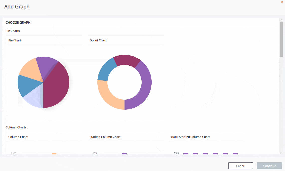
Just like with Cimpl, adding graphs should be a breeze. There are 5 different categories of graphs, and a total of 14 types of graphs you can use:
- Pie charts
- Pie chart
- Donut chart
- Column charts
- Column chart
- Stacked column chart
- 100% stacked column chart
- Bar charts
- Bar chart
- Stacked bar chart
- 100% stacked bar chart
- Line charts
- Line chart
- Smooth line chart
- Stepped line chart
- Area charts
- Area chart
- Stacked area chart
- 100% stacked area chart
Whether you prefer to simply display the data, or even combine it to total a 100% ratio, the possibilities are close to endless. And, of course, you can choose any set of metrics to be displayed in your graph, according to the type of report you’re working on. Furthermore, nearly every single type of report in Cimpl can be converted into a graph, isn’t that wonderful?
And last but not least, you can share it, export it, save it (in many different formats), and even schedule it. You now also have the ability to add graphical reports to the Monthly Executive Analytics Report, so your upper management can browse faster through the data and get a full grasp on how the IT department is doing!
Everything you need to let your company know what is going on with your technological environment in an easy and comprehensive way is at your fingertips. Let’s get started!