
There’s more to content marketing than copy alone.
Infographics engage an audience in microseconds, pairing helpful stats with serious eye-candy to deliver a super-targeted marketing message. Better yet, this type of content is pure viral marketing gold.
These 10 infographics showcase content marketing at its most visual, viral, and valuable; and prove that infographics are one of the most powerful tools in any B2B marketer’s arsenal.
1. Lander’s Split-Testing Infographic

There’s no escaping the fact that infographics have to look great, first and foremost. In this example, Lander uses their serious design-savviness to tackle a complicated concept, creating stunning graphics to illustrate a step-by-step guide to A/B split-testing. Its elegant design solves a complex problem with brevity, and promotes their business proposition in a subtle and unobtrusive way.
2. Email Monks’ Holiday Marketing Infographic
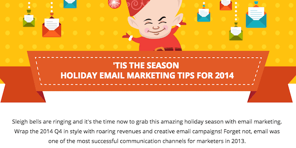
Email Monks’ visual guide to effective festive marketing proves that infographics can take advantage of seasonal trends. Their design pairs valuable end-of-year marketing takeaways with a brand-consistent color scheme and graphics—capitalizing on holiday season virality to drive a ton of targeted traffic back to their site.
3. UNC’s ROI of an MBA Infographic

Pitched at professionals considering an online business course, UNC’s infographic discusses the program’s benefits in terms that its audience will care about: costs, benefits, and ROI. It’s an example of an infographic being used to liven up a potentially dull topic—combining persuasive data, industry-relevant language, and beautifully simple graphics.
4. Unbounce’s B2B Lead Gen Infographic
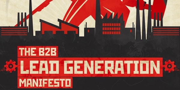
Infographics are dime a dozen, even within the B2B sector. Stand-out content needs more than great advice and great design—it has to have personality. Unbounce illustrates this concept perfectly, with a Soviet-style look at lead generation that packs more originality into its design than any other infographic I’ve seen. Helpful stats and advice are paired with a unique design flair, leaving a lasting impression of both infographic and business.
5. BopDesign’s SMM Showdown Infographic
Awesome infographics are often awesomely simple. Straightforward designs avoid one of content marketing’s biggest pitfalls: trying to tackle too many topics, and solve too many problems. BopDesign demonstrates the principle perfectly, taking an in-depth look at a single problem, and solving it as comprehensively as possible.
6. Neolane’s Age of Apps Infographic
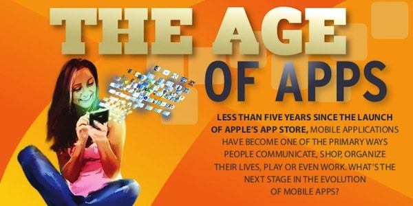
Neolane (now Adobe Campaign) has created a killer case-study in contextual marketing, with their look at the evolution of the mobile app. They take an engaging look at tech-history, using persuasive stats and great graphics to both highlight a need for branded apps and position the company as a potential solution.
7. Lunametrics’ Social Media Cheat Sheet Infographic
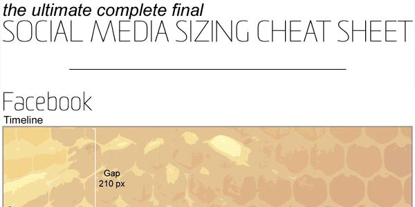
This beautifully simple design from Lunametrics doesn’t reinvent the wheel—it just streamlines the day-to-day activities of its audience. It provides an at-a-glance reference of the optimum sizes for all manner of social media images. It’s easy to produce, easy to digest, and a great example of simple infographics used effectively.
8. Monetate’s Ecommerce Infographic
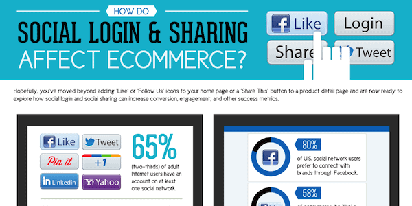
Content marketing finds its value from effective targeting. Infographics are no different; and this example from Monetate tackles a super-specific problem, aimed at a super-specific audience. Whilst this type of content might never receive thousands of shares, you can rest-assured that every share it does get is super-relevant and super-engaged.
9. Yottaa’s Performance Metrics 101 Infographic
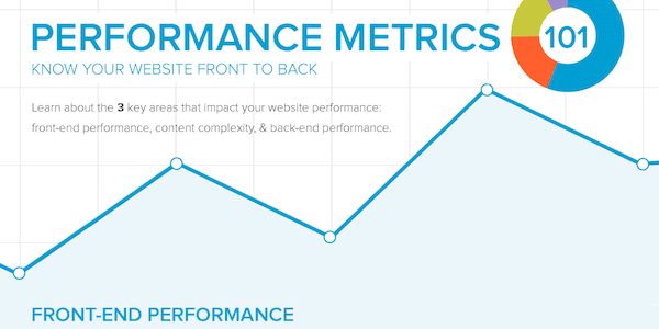
Many infographics suffer from a surplus of data, and a lack of real insight. Yottaa not only bucks this trend with their own design, but also provides guidance for other data-hungry marketers in the process. They’ve taken a comprehensive look at crucial website performance metrics, and how to use them—creating a business cheat sheet that’s as actionable as it is attractive.
10. Follygraph’s Perfect Coffee Infographic
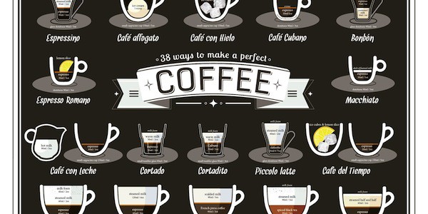
No matter how complicated the industry, B2B audiences are still composed of real people. Sometimes, a tongue-in-cheek look at an industry’s unique culture can be incredibly effective. Case in point: where would marketing be without our steadfast ally, the humble coffee?
Thanks to this infographic from marketing designers Follygraph, we need no longer constrain ourselves to boring black coffee. With 38 delicious and obscure drinks to choose from, we can fuel our day (and annoy our barista) with everything from a cortado to a mazagran—proving that valuable infographics don’t always have to think squarely in terms of stats, data and ROI.
Get Inspired
Never miss a chance to make your content even better by subscribing to our weekly newsletter to get more tips and tricks for creating best-in-class content.