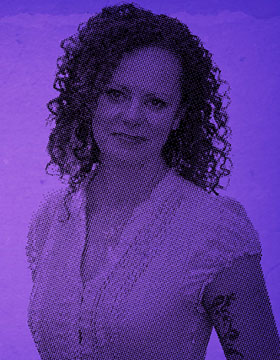
Marta Kagan isn’t just an early adopter of SlideShare, she’s a widely read and often imitated master of the platform. She’s created more than 500 presentations and collected more than 5 million views since 2008.
A quick look at her profile tells you why. Marta employs a skilled eye and pull-no-punches style in her presentations, creating work that both informs and entertains the masses.
We asked her to share some nuggets of wisdom for our Masters of SlideShare project. She provided so much wit and insight that we decided to share the whole interview here.
When did you first start using SlideShare and what drew you to it?
First a little background:
When I started my career in marketing, most companies didn’t have a website (yet). Google did not exist. Neither did Amazon. Mark Zuckerberg was still in elementary school. And PowerPoint was a 4-year-old Microsoft product that had not yet bored anyone to tears.
I spent the first 10 years of my career helping global consumer brands figure out what the hell to do with the “Internet fad” with varying degrees of resistance. I used PowerPoint frequently as a tool for communicating new ideas, pitching potential clients, and inspiring change. But I was not yet a PowerPoint Ninja.
“I had some pretty strong opinions…I wasn’t afraid to use my overactive potty mouth to express them.”
In 2008, the same year that Apple introduced the iPhone and Facebook overtook MySpace as the largest social network (with a paltry 115 Million users), I created a PowerPoint presentation called What the F**k is Social Media. I had some pretty strong opinions about social media, and I wasn’t afraid to use my overactive potty mouth to express them. I posted the presentation on SlideShare—which had less than 1 million users at the time—and emailed the link to a handful of my peers.
A day later, What the F**k is Social Media had 50,000 views. A week later, 100,000. The rest, as they say, is history.
Five years, 500 presentations, and 5 million views later, my work continues to be among the most downloaded, featured, tweeted, “liked,” “pinned,” shared, and imitated on social sites across the globe.
SlideShare is a unique forum unlike other “social networks.” When crafting a presentation for it what are the “rules” or guidelines you follow?
I follow the same basic rules that apply to any presentation I create, whether for SlideShare or not:
1. Start with one very simply, bold, memorable message. Every slide, image, chart, etc. should be in service of emphasizing, illustrating, and supporting that one message. Period.
“Start with one very simply, bold, memorable message.” @mzkagan on #SlideShare
2. “WHY” should come before “HOW” and definitely before “WHAT.” If you don’t provide a clear and compelling reason for people to care about your message/story immediately, you’ve already failed.
Starting with “why” is critical to that. Otherwise, it’s like offering a guest coffee, but failing to provide a cup. Once you’ve established the “why,” tell your audience “how”—how do they get from the problem you’ve identified to the solution/action that you propose? Then, and only then, should you dive into the “what” (ie your product, service, brand, etc.). The vast majority of presentations do this totally backwards.
3. Logic isn’t enough. If it were, nobody would smoke. If your goal is to create a presentation that influences and inspires action—and if it isn’t why bother?—then you have to make your audience feel.
4. A picture really is worth 1,000 words. Humans process images 60,000 times faster than words. We also recall images 6x more easily than text. This is known as the Picture Superiority Effect. And it’s the reason why I put a tremendous amount of time into selecting images, typography, and layouts that maximize the visual impact of each and every slide.
“You have to make your audience feel.” @mzkagan on #SlideShare
5. Story > slides. It’s tempting (and one might argue, easier) to start creating a presentation by opening up PowerPoint and using the default Title/Bullets structure; or to rework existing slides into a “new” presentation with fresh images and a different “look.” That approach, however, completely misses the point of what a presentation is meant to be: a visual story.
So before I fire up any software or put any thought into the images, typography, etc. of a presentation, I carefully craft the complete story—beginning, middle, and end. Most of my presentations rely on traditional “Three Act” story structure (with the occasional departure), because (a) it’s very familiar, (b) it provides an excellent “skeleton” for telling great stories, and (c) it makes it easier to do step 1 through 4!
For someone just getting started with SlideShare, what would be your first piece of advice?
Read (and then re-read) the 5 points I shared above. Then spend a few hours browsing through the most popular presentations of the year and of “all time” on SlideShare to get a feel for what works.
You clearly believe in the “wow” factor. How do you find ways to make wow content again and again with SlideShare?
I live by my own “Martafy” mantra: simple, bold, remarkable. Because good enough isn’t f**king good enough.
