Email Best Practice Guidelines
You can find guidelines for optimizing each section of your email in the sections below. Once you’ve absorbed the tips, peruse our gallery of ideal emails for inspiration.
Subject Line
You have 2-3 seconds to capture a reader’s attention amidst the crowd of emails in their overflowing inbox, so an eye-catching subject line is key.
The best email subject lines are short, descriptive, and provide your audience with a reason to explore your message further. Be direct and always answer this question from their viewpoint: “What’s in it for me?” Personalizing emails in some way is a good idea. For example, adding a city name to an offer email will make the message seem more relevant to the recipient.
The first 2-4 words of your subject line are the most important as they are seen first, so spend more time carefully crafting those words and less time worrying about the total length of the subject line. While short subject lines typically do perform better, keeping your message under 50 characters is no longer a hard and fast rule. Above all, you want to be sure to avoid words that will trigger spam filters to relegate your email to the dreaded SPAM folder. Check out the full list of spam words to avoid from HubSpot.
One last thing to experiment with in your subject line is special characters. Check out how these emails from the St. Louis Post-Dispatch really stand out in the inbox:

Keep in mind the “From” name and consider how your unopened email will appear in someone’s inbox. Your “From” name can affect open rates as people scan these to identify a trusted sender, so keep this consistent and trustworthy.
Pre-header Text
This is the text that shows up right after your subject line in someone’s inbox and appears above your header image when your email is opened. This should support your subject line and further intrigue.
Here’s how the pre-header text appears before your email is opened:
![]()
And here’s how it appears after:

Finally, this is how to pre-header text looks on mobile, where it is even more prevalent:
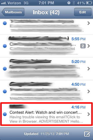
Avoid the default “Can’t view this email? Click here” and make the most of your chance to customize the message.
Body
There are 4 things to keep in mind as you are crafting the body of your email messages:
- Keep the good stuff above the fold. Remember that many email clients will obscure a large portion of your email unless the user scrolls down. Make sure the top 400 pixels are as engaging as possible. The top left-hand quadrant in particular is the most important as this is seen first in many preview panes. Keep your header image and branding as short in height as possible – get right to the good stuff as the top of the email is precious real estate!
- Make it mobile-friendly. According to Experian Marketing Services, more than half of all email opens take place on mobile phones, and that number will only continue to grow. Due to the limitations of many email clients, stick with a width somewhere between 500 to 600 pixels wide. Keep small screens in mind by making your fonts bigger (at least 14 px) and make your call to action (CTA) buttons bigger.
- Make sure it’s legible with images disabled. This often-overlooked tip is crucial! Always take into account the appearance of your email with images disabled. For email clients such as Outlook, images are blocked by default. Even popular web mails like Gmail now disable images unless the sender is in the address book of the recipient. Make your design with a focus on text first. While designing one solid image for your newsletter seems easy, it will hurt you in the long run. An email with a low image-to-text ratio will get caught in spam filters. It is also not very useful to your recipients – they will get a blank email in their inbox, and your message will be deleted faster than you know.
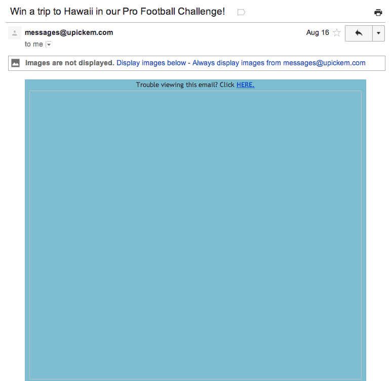
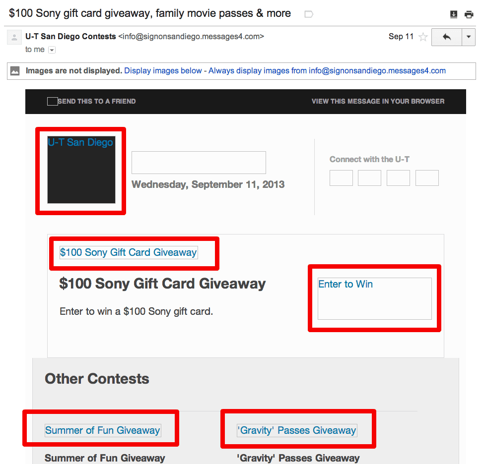
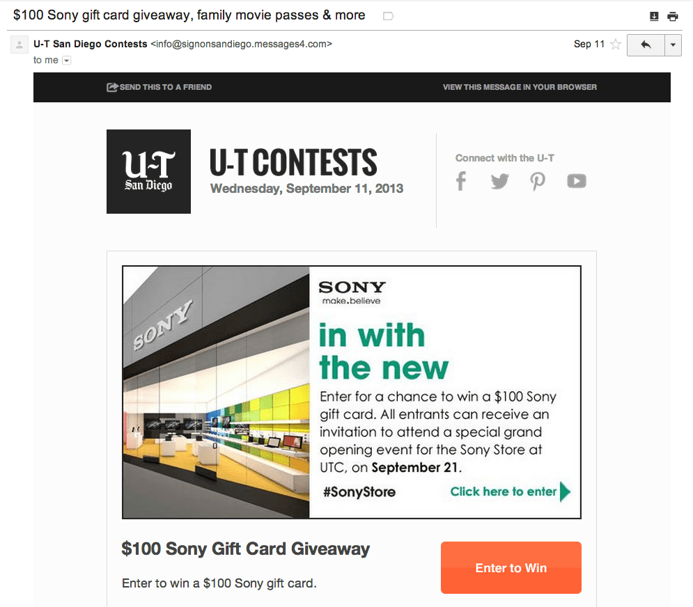
The best tactic to create readable emails with images blocked is to put your important messages in HTML text rather than images, especially things like links or calls to action. You can also use an alt description with your images. You can see in this example from U-T San Diego, they are using alt text for their images – the images (marked by red boxes below) are blocked by default. They also have a good amount of text integrated. This ensures that folks can still understand the message and see the calls to action even if they don’t download the images.
This is what the email looks like with images enabled:
- Include a call to action. Each section must contain a specific call to action that avoids vague phrases like “click here.” You’ll be surprised how an effective call to action button or link can improve your click through rate! Make sure this call to action is visible even with images off.
Footer
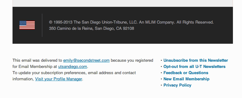
To be compliant with CAN-SPAM laws, your message must include your valid physical postal address and an option to unsubscribe. The footer is the perfect place to put this information, as you can see in the example below.
Ideal Emails
Take a look at a few ideal emails in both the weekly newsletter and promotional announcement categories.
Weekly Newsletter
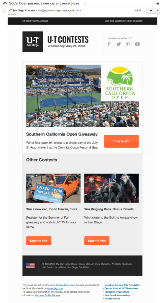
This email from U-T San Diego’s U-T Contests has a great subject line and really strong calls to action in the body of the email. Furthermore, the “Enter to Win” buttons stand out and beg to be clicked.
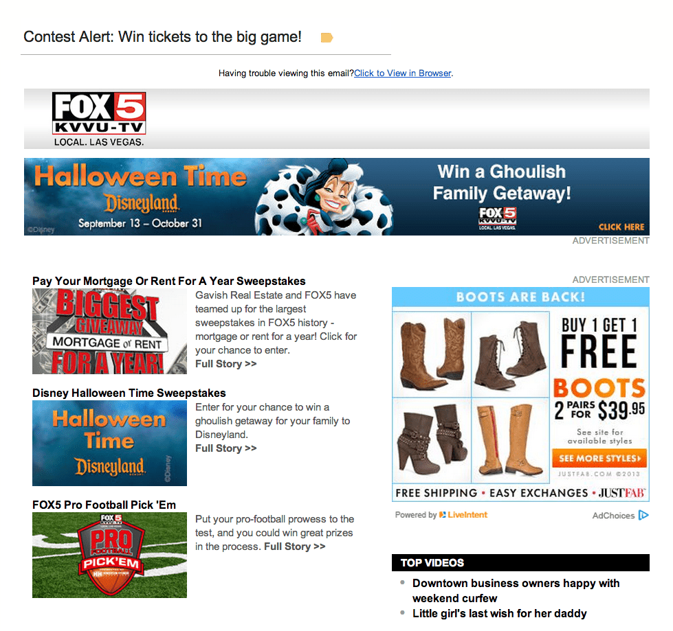
The size of KVVU-TV’s banner across the top is perfect. Shorter is better because it lets readers get right to the message and calls to action. Not only does this email have a great subject line, it also features Top Videos which allows readers to engage with the station’s news product as well as their contests!
Contest Promotion
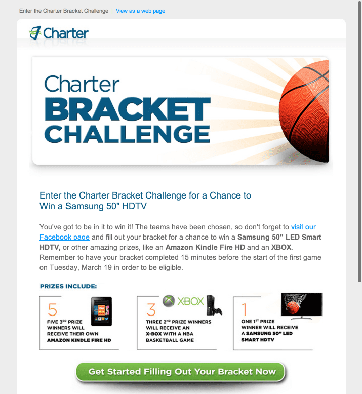
This invitation email from Charter is stellar because of it’s focus on a single topic. When the goal is to activate a promotion or interactive content, a dedicated email with one call to action is the most effective. If you can, it’s best to keep it simple and craft an entire email encouraging readers to take one action and click one button.
Deal Promotion
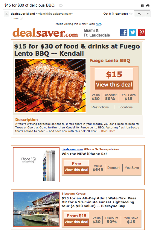
Dealsaver Miami always sends out fantastic deal emails. Their subject lines are short, descriptive, and enticing, plus the layout is simple and easy to read, the top banner is the perfect height, and the calls to action really stand out. They are even promoting a sweepstakes!
