In the ever-changing landscape of technology, mobile devices have become even more prominent and important. The first smartphone, as we know them today, was the original iPhone, released in the USA in June 2007, then in Europe from November that year. In 2012, smartphone sales overtook PC sales, in 2013 smartphone sales overtook those of feature phones, and then in 2016 mobile internet usage overtook desktop usage in the USA.
Currently, ~58% of internet traffic comes from mobile devices, followed by ~39% from desktop, and in 2023, there were 6.84 billion smartphones and 16.8 billion mobile devices we used worldwide.
This increase in mobile devices and usage in turn caused a change in our behavior. Receiving notifications actually causes a dopamine release, meaning we feel ‘rewarded’ by every notification, interaction, swipe, or scroll from our smartphone, causes us to reach for them more often.
Smartphones have also made digital advertising mainstream, forcing marketers to rethink their approach. Since 2015, mobile-friendly websites have received priority placement for Google searches made on mobile devices. Smartphones also store data on an individuals tastes and references. This has made it easier to personalize advertising messages to make them more specific to each individual. From this, people have come to expect relevance from advertisements.
Why Mobile First Design Matters
People no longer want just a ‘good’ email experience – they expect it. And a failure to meet this expectation means fewer opens, clicks, conversions, and at the end of the day, revenue.
Here are a few stats to drive home the importance of a good mobile experience:
- 81% of emails are now opened on mobile instead of desktop
- 52% of customers are less likely to engage because of poor mobile experience
- The average person checks their phone 144 times per day
- It only takes a person 3 seconds to decide to delete an email that is not displaying correctly
- Mobile users check their email 3x more often than desktop users
- The average attention span is 8 seconds
The Fundamentals of Mobile Design
There are 3 fundamental principles of the mobile-first email design:
- Progressive Enhancement: A method of building digital content and applications in a way that prioritizes usability across all environments
- Graceful Degradation: Beginning with the most modern and complex styles and functions and then adds options that gracefully degrade what is presented to the user
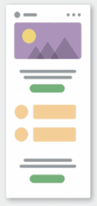
- Mobile Stacking: Optimizing content for mobile devices by vertically placing content areas (images, text) as phone and tablets have a minimal viewing area, so a single column is the optimal layout
These help inform your design choices. Getting into the nitty-gritty, we’ve provided more best practices for the different aspects of your design.
Formatting and Designing Emails
As a rule of thumb, your goals of a well-designed email will be an email that:
- Renders correctly
- Resonates with your target audience
- Is easy to reach and understand the purpose
- Is aesthetically pleasing
- Ensures the user can instantly recognize your brand
Layouts and Hierarchy
Stick to a simple email layout and utilize single columns to keep your email scannable and accessible. As you curate your email, apply a visual hierarchy to create clear differences that reinforce importance. You can do this by using variations of:
- Text size
- Color
- Placement
- Whitespaces

Make sure you promote key messages and actions through placement and relevant visuals and differentiate before headlines and CTAs.
Responsive Design
You can create different designs that appear depending on the device the user is viewing the email with – or a design that is responsive to the device being used. For example, an email viewed on desktop would have multiple columns of content across rows to fit the screensize, where on mobile, the columns would stack, making the content clearer and easier to scroll within.
Reading Patterns
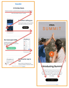
Mobile devices have a minimal viewing area, so the single priority zones are in the top left and top right. People usually read with 2 patterns: a Z pattern or an inverted pyramid.

Because of this, you’ll want to remember to draw the eye of your readers by:
- Bolding key ideas
- Dividing paragraphs
- Ensuring a clickable area upon opening
Mobile Specific Design
Designing for mobile is a lot more than ensuring your template adapts responsively to the screen size – although that is the most important aspect to be aware of. You also need to consider how people will navigate the email and consume the content.
- Below the fold design
People are used to scrolling now, so above the fold content is less important than it used to be, but you should still consider it by highlighting important information sooner and ensuring your header doesn’t diminish the important content.
- Avoid Clipping
Different inbox providers will clip your email, or only loading part of of your email and prompting the recipient to take extra action to view it all, dependent on different criteria. It could be based on the pure length of the email or it could be the size in megabytes of the email. Because of this, you’ll want to keep your HTML light, user hyperlinks to limit email size, remove unnecessary images, and TEST your emails with different inbox providers.
- Images Disabled
All inbox providers now offer images off as a privacy measure (although Outlook and AOL are the biggest culprits) so it’s important to consider how your email will render with images turned off. This is where your text to image ration will come into play – if you send an email that is all image, and the recipient has images disabled, they will not see any of your content. Remember to put key information outside of images, make sure your buttons are coded (and not images), use ALT text, and insert tracking pixels for analytics and reporting.
More to Consider
Email-Safe Fonts
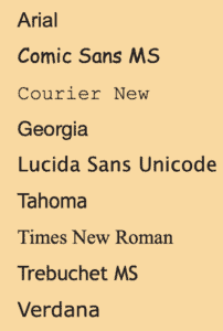
Email-safe fonts, or typefaces, are fonts that are pre-loaded in your computer/mobile device’s memory. They are the most readable and accessible, and allow for almost guaranteed consistency across ESP’s. These are fonts you should consider using, instead of an obscure, uncommon font.

A little more on font best practices:
- Minimize the use of more than 2 fonts
- Font sizes help shape your email look and feel
- More bold and minimal text is better
- 16pt is the standard body font size
CTAs
CTAs should be eye-catching and enticing, as they are the driving force for your recipients to perform an action within your email. And remember, the buttons for CTAs should be a coded button, not image based.
Primary CTAs will be the main action you’d like the recipient to take. They should stand out with a different color, bolding, or more white space.
Secondary CTAs are additional actions you’d like the recipient to take, but are less of a priority than the primary CTA. These will be less styled, not drawing attention away from the primary CTA, but still drawing the eye of your reader.

Imagery
While 5G is taking over, many mobile devices still support only 3G, and slower image downloads result in fewer clicks and conversions as audiences expect near-instantaneous load-speed. Because of this, you’ll want to use imagery wisely and decrease the file size by using compression. A few sizes to remember:
- JPGs and PNGs should be no larger than 500KB
- GIFs should be no larger than 600KB
Colors
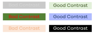
Make sure the colors you are using provide a readable contrast. For example, white text on a gray background is going to be extremely hard to read, whereas white text on a black background is very easy to read.

Your emails should utilize your brand colors and, as a best practice, avoid using more than 5 different colors in your emails. This can distract from your content or actions you’d like your readers to take.
Dark Mode
Many devices now offer Dark Mode for easier viewing and screen reading. It provides a darker color palette for low-light/nighttime. Dark Mode email is unfortunately harder to code for, so expect higher estimates in time & cost from developers. When designing for dark mode, all logos and icons will need to be transparent PNGs, and you’ll want to use colors that work in both light and dark mode.
Accessibility
When designing your emails, keep inclusivity in mind by including as much accessibility as possible:
- 14px should be the minimum font size
- Include sufficient contrast between text and background colors
- Provide text alternatives for images and avoid image only emails
- Curate simple, subscriber friendly emails
- Increase readability by left aligning your body copy
