
“Design is artwork, not artmessing-about“.
That’s how Justine Jordan, Litmus’ Marketing Director opened her presentation at Marketing Sherpa’s 2015 Email Summit. She hosted one of key skill sessions discussing email elements, design in particular. Justine argued that every email marketer should understand design. Even though they’re not necessarily a designer, they might still need to make decisions with regards to it.
She discussed two main email design concepts to get right as a non-designer.
White space
What is white space and why do I need it in an email?
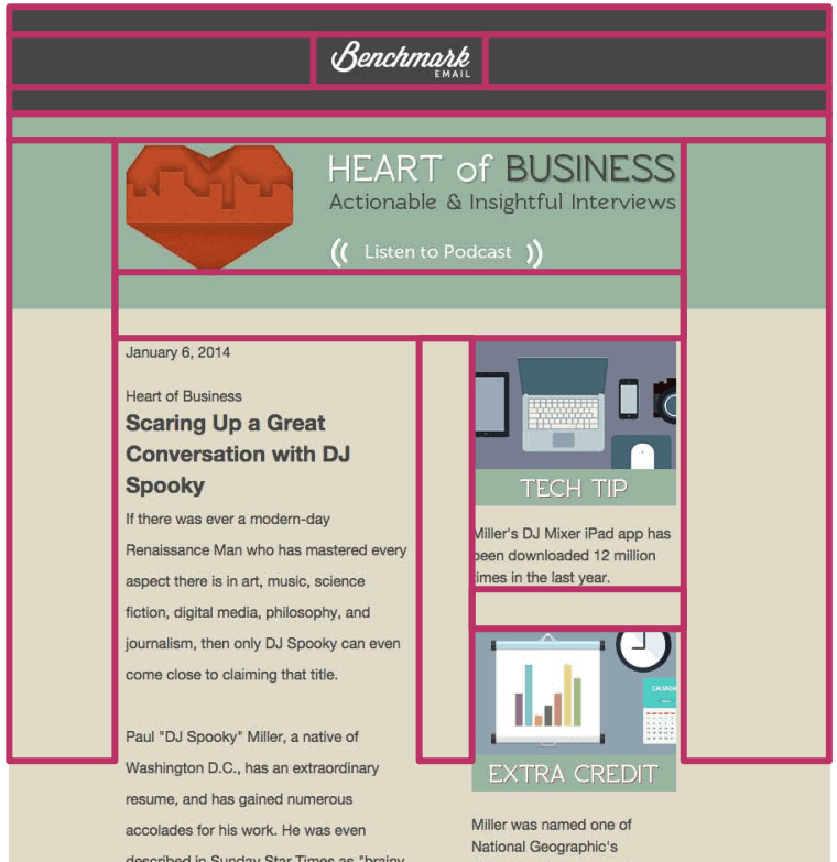
Generally called white space, the term refers to the empty space in a design and it can be any color. See below for example.
The pink boxes highlight the empty space in the design, which allows the eye to focus on what’s important. But don’t just think of it in terms of space between sections, it can also be the space between lines of text.
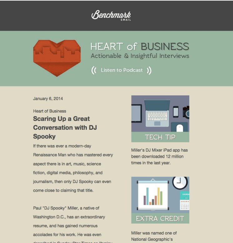
This is how your email might be laid out
(example used in Justine Jordan’s presentation)
White space areas highlighted in pink
(example used in Justine Jordan’s presentation)
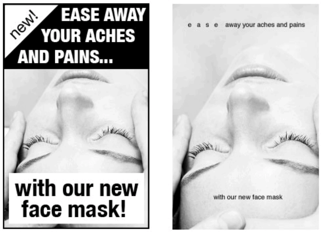
The use of white space can also give the sense of premium quality, of luxury. Compare the two examples underneath, for instance.
White space:
- sets the tone
- guides the eye to certain elements
- creates balance
- improves readability and comprehension by 20%
How much white space do I need?
As a guideline, Justine had this handy trick for getting just the right amount of white space. She recommended about 40-60 px between email elements like images, blocks of copy, call-to-actions buttons, etc. If you don’t know what that means, she said it’s the rough equivalent of placing your thumb on the screen.
Hierarchy
What hierarchy should I follow in my emails?
Hierarchy refers to the relation between elements and sections of your email. You can express that through size and order of elements.
The hierarchy you follow depends entirely on your content, and what you’re trying to achieve, but here are a few tips:
- Place important and eye-catching elements above-the-fold – if you can’t catch your audience’s attention with the beginning, they won’t bother to read the rest of it
- Single or multiple calls-to-action? – if you choose to use multiple ones, make sure your most important CTA is bolder (through size or colour) than the rest, so your subscribers are not confused about where they should click first
- Guide the reader through design – make sure you’re consistent with the style and size of your headings, subheads, links and your body copy.
We’ve briefly brushed on two concepts. If you’d like to know more about design for maximum message impact, download our guide When Email Marketing Meets Design Theory.