Blog: Email Marketing Strategy & Tactics
Email design is archaic on its best days. There has been little progress with email design compared to other mediums and technology/devices over the last 20 years. So when something new and different comes along you’re nothing short of amazed. Email geeks like myself are always looking for new and interesting ways to make your messages stand out in the inbox. This week’s BCE! example blew my mind in ways I haven’t experienced since my first Jimmy Buffett concert.

I tend to gloss over most of the emails I receive from Disney, but this month’s newsletter caught my eye instantly. Finding a way to present the subject line upside down was a feat of wizardry only befitting Disney’s magical history. In my 10 years as an email designer, I had never seen this execution before, so like a cat with a laser pointer, I couldn’t stop staring. Like I said before, anything new and interesting in email is something you tend to notice.
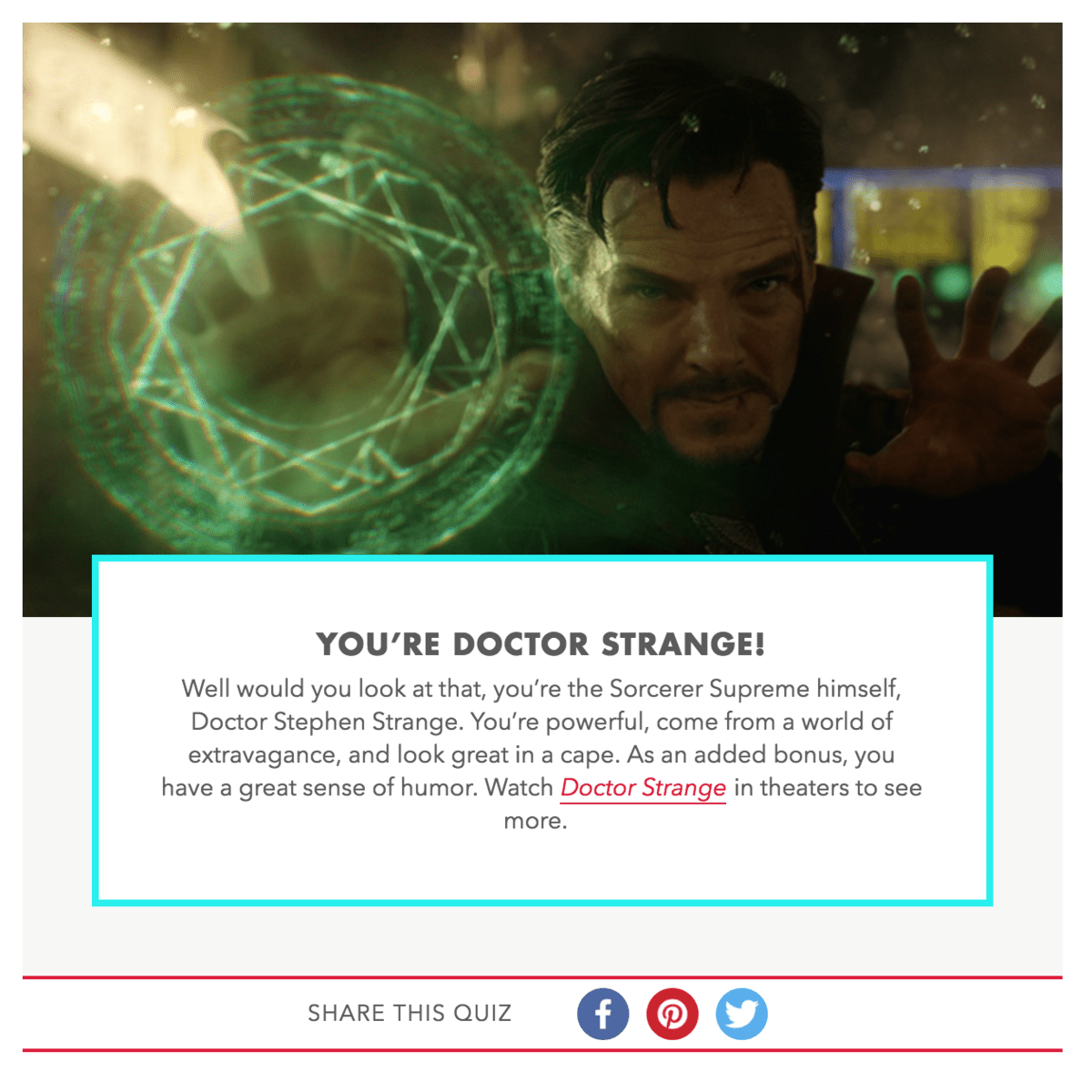
They originally had me with the subject line, but they finished the job with Benedict Cumberbatch as Dr. Strange. I’m a huge lover of the Marvel Franchise and the Dr. Strange character, and an even huger lover of Benedict Cumberbatch. Throw in Tilda Swinton and Chiwetel Ejiofor and I got lost in a 20-minute debate about the greatest character actors of our generation before I even noticed there was a quiz. Side note: I got Dr. Strange. If you’d like to discover which Dr. Strange character you are you can take the quiz here.

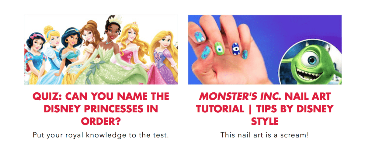
Disney does a great job of conjuring up a nice variety of relevant, interesting content that is bound to entice someone to click. It certainly doesn’t hurt to have access to some of the most recognizable imagery and valuable brand assets on the planet, but one thing that really stood out to me were the headlines. As much as I love the large red, bold, all-cap headline styling, I was most impressed by how well-written their copy was. It’s a subtle thing that might go unnoticed by the average person, but they do a fantastic job of being completely on point with their brand message and voice as well as crafting their words in such a way the just make you want to know more.

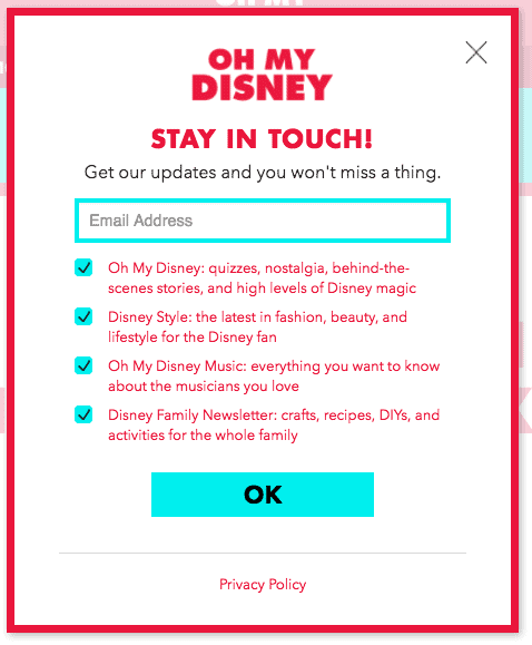
The last and most impressive thing I discovered at the bottom of the message was the inclusion of two optional newsletters that Disney offers. More and more publishers that offer a wide variety of content are including these optional newsletter signups to give their audience a more tailored experience. Giving your audience more control over the type of content they want to receive only helps build that relationship between your brand and your subscribers. If they are constantly receiving content they’re interested in, it increases your engagement metrics as well as keeps your audience list healthy and active.

Once you click you’re taken to a landing page that gives you a high-level overview of what type of content is available. Upon clicking to confirm your signup, you’re taken to a secondary page that allows you to select the different types of email newsletters you would like to receive, which include categories such as Quizzes, Fashion, Music and Family Fun. I think it’s a pretty fantastic idea to allow your subscribers to pick and choose the content that they care most about. Overall, Disney just keeps being Disney. They have amazing content and they aren’t afraid to share it, and they’re always coming up with innovative ways to stand out and be noticed. In the meantime, I’ll keep trying to harness my mystical powers to find new and fascinating emails to share.
 Corey Duncan
Corey serves as PostUp’s Interactive Creative Director, where he manages and designs all creative development for the Professional Services department. He is responsible for designing, implementing and tracking everything from email, web banners, websites, social media and SMS while adhering to digital marketing best practices.
