
Designing for mobile is a hot topic in web and email design right now. It has created confusion, excitement and plenty of debate. I recently discussed the difference between fixed, fluid, adaptive and responsive design. With this in mind, I’m going to look at two of the main ways of designing mobile-friendly emails: responsive vs single-column.
Why is responsive the way forward?
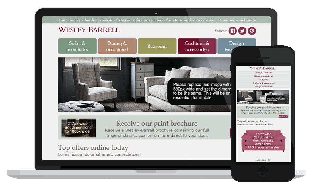
Responsive emails rearrange the content of the email for a great user experience on most devices. They do this using media queries, scaling images and using browser data to ‘choose’ which version to render based on the device.
This means that text sizes are expressed in em, which makes the text scalable to the device size. Images and videos also scale up or down, and the layout rearranges to ‘respond’ to the screen. All this adds up to a natural user experience as the email either optimizes for scrolling on a mobile device, or fills the screen on a desktop monitor.
What are the disadvantages of responsive design?
Responsive design works by changing layout and sizes at certain breakpoints pre-set by the email designer. Therefore, the designer needs to anticipate and specify how the elements of the email should rearrange. This will take longer to code than, say, a fixed template. However, it’s worth making sure your main template is responsive, since you’re going to use again and again.
Another problem is that not all mobile email clients will read the media queries which make the email ‘respond’. The Gmail app for Android is one of them. So it’s always best to check your Email Client Reports and see what your subscribers use.
 When should you go with a single-column design?
Single-column design, or skinny as some have called it, is long and not too wide so it suits the scrolling behaviour of mobile users. Because of the audience it’s designed for, text is often supersized, and links are presented like buttons for an easy tap and open.
If a large majority of your subscribers open on a mobile platform, then a mobile-first design could be the answer for you. If not, it can still make a great design for a one-off email as it take less time to code than a responsive ones. It works well when you want to do something different without straining your resources.
Be careful of the lazy fix
The problem with a single-column design is that it might not look great on a desktop, which is why some people regard it as a lazy fix. When opened on desktops, single-column designs could:
- Look supersized in terms of text and buttons
- Have too much white space on either side of the email design
- Make subscribers scroll too much to find the information they need
But don’t feel discouraged. As long as you cater to your audience, and not everyone, then you will know which option is right for you.
How? Look at your Email Clients Report to know what email clients and platforms your audience uses. If it’s quite divided between desktop and mobile, then responsive might be the template for you. Also look at the open- and click-rates: low rates will signal that you might need a different approach to your current template. Or if you have just changed your email template, monitor results for a few months to make sure nothing else is impacting your results.
Interested in learning more about email design? Download our new eGuide ‘When Email Marketing Meets Design Theory. How to make your emails look fabulous and deliver results‘.