
Every year, more B2B marketers jump on board the SlideShare train.
In 2012, only 23% reported using the platform. By 2013, that number jumped to 40%, making it one of the fastest-growing social media sites for B2B marketers.
But as this content-sharing, lead-driving platform gains popularity, it becomes increasingly difficult to make a splash.
Luckily for us, the SlideShare pros are sharing their tips and best practices…and what better way to show off their expertise than with brilliant presentations? Check out the nine SlideShares below, both for the content and the how it’s presented.
#1. How to Get Picked for the SlideShare Homepage – view it here
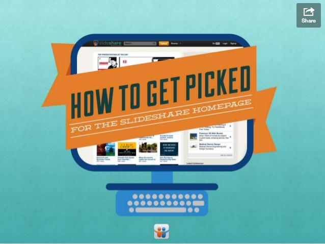
Number of slides: 17
Number of views: 150,735
Synopsis: This is a quick guide to what SlideShare looks for in choosing slides to post on their homepage. Their advice? To get featured on the homepage of SlideShare think about these seven things:
- A good headline
- A good cover slide
- Good design
- Engaging info, presented captivatingly
- Short, comprehensive messaging
- Newsy
- Trendy/Innovative
What I loved: Really, this is a quintessential SlideShare presentation, especially since it is SlideShare made. But my favorite thing is the thumbs up symbol at the top right hand corner of each slide. It helped me understand how far along in the presentation I was I clicked through.
#2. 6 Tips for Repurposing Content on SlideShare – view it here
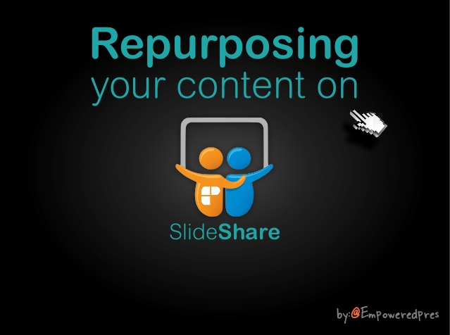
Number of slides: 47
Number of views: 38,603
Synopsis: This presentation is a modern take on the classic saying: Don’t work hard, work smart. The main point is that you can publish any one piece of content into multiple platforms. Here is a 47-slide presentation on how and where to repurpose content assets.
What I loved: The idea that eBooks could surpass printed books (re: slide 6).
#3. You Suck at PowerPoint – view it here
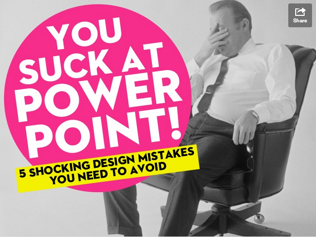
Number of slides: 61
Number of views: 1,458,086
Synopsis: The 5 PowerPoint design mistakes that activate your gag reflex are:
- Too much info
- Not enough visuals
- Horrible quality
- Visual vomit
- Lack of prep
What I loved: My favorite slide is slide 38, which simply reads “Whitespace is a good thing.” It showcases the thing I like most about this presentation…which is the simple, often one-sentence statements on each slide.
#4. How to Make Your Charts Sexy Enough for Justin Timberlake – view it here

Number of slides: 36
Number of views: 2,036
Synopsis: In order to create a sexy SlideShare, this presentation says your charts are gonna have to look better than a 1992 Microsoft excel pie chart. (Or worse yet, a screen shot of a 1992 Microsoft excel pie chart.) Here’s the recipe for sexy charts:
- Remove all the noise.
- Add a background image.
- Awesome fonts, not awful ones. (Though we’d suggest bigger ones, please — see critique.)
- Add some labels.
- Draw the eye to what matters
What I loved: I love the step-by-step slides of improvements in the making. It gives visual learners a good guide and reference, while others can just follow the steps. The final “voila!” page (re: slide 33) even makes the user feel accomplished.
#5. 11 Foolproof Ways to Ruin Your Presentation Slides – view it here

Number of slides: 13
Number of views: 77,559
Synopsis: This is a funny piece on the most nauseating mistakes that occur on PowerPoint, and I can honestly say: their grate! (wink)
What I loved: Hilarious common mistakes. I was highly entertained by the stock images, comic sans font, and typos right off the bat!
#6. 3 Steps to Prevent Presentation Pollution – view it here

Number of slides: 37
Number of views: 28,338
Synopsis: Cleaner, to-the-point slides are best.
What I loved: The design.
#7. 10 Million Presentations Uploaded to SlideShare – view it here
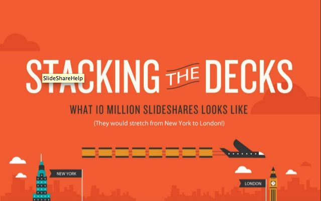
Number of slides: 7
Number of views: 56,983
Synopsis: Short and sweet data and information about SlideShare presentations like: languages SlideShare is written in, most common SlideShare categories, and popular SlideShare topics by number of presentations.
What I loved? The brevity. The new information. The unique perspective on SlideShare.
#8. 10 Tips for Using SlideShare for Lead Generation – view it here
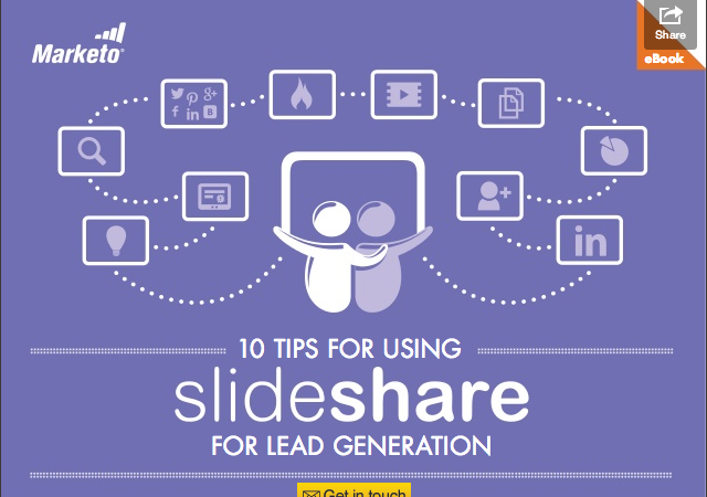
Number of slides: 14
Number of views: 15,951
Synopsis: A PowerPoint, presentation, or SlideShare guide for even the most novice marketer. This is a simple digest of what you’ve got to do to create a presentation for lead generation. Which basically are:
- Identify a topic
- Create a good title slide
- Give each page SEO love
- Integrate your presentation across channels
- Roll your presentation out with strategy
- Integrate it your larger marketing strategy
- Repurpose it
- Do analytics
- Turn on “forms option” for lead generation
- Add SlideShare presos to your personal LinkedIn page
What I loved: This presentation wasn’t too glitzy. The point was to be authoritative, and the presentation represented that well. Sometimes, I find SlideShare presentations value design over content. This one held firm to presenting information before glamour.
#9. Masters of SlideShare: Indispensable Advice from the Best of the Craft – view it here

Number of slides: 30
Number of views: 10,644
Synopsis: This is a compilation of quotes from the best SlideShare developers. The presentation reveals patters for best practices SlideShare creation, and great guidance.
What I loved: The photos of each “master” personalized the presentation and somehow made each quote feel more true. I also like the “tweet this” feature on each slide.