Everyone has their favorite news source. Whether it’s a local news anchor, a particular print journalist, or a carrier pigeon with a blog, that go-to source is their first stop when something big goes down.
For more people than ever, that must-read source is email. News junkies turn to the email inbox for their morning fix, an afternoon wrap-up, or even breaking news alerts (which publishers can easily automate to keep email fans in the know). Why do so many readers prefer email newsletters? Well, the inbox is friendly, self-contained, and doesn’t overwhelm you with endlessly-scrolling content. You can self-select the news you want, however often you want it. You don’t have to scour social media for what you want; email comes right to you.
And it’s not just readers who like email; publishers like it too. It’s a way for publishers to connect directly with readers, especially when those readers aren’t downloading apps anymore. Despite all the “pivoting to video,” data shows that text content in any place is still more engaging than video. They’re a money-making machine. Plus, email newsletters are fairly simple to start. (In fact, if that pigeon can blog, he can probably put together an email newsletter too.)
But just because email newsletters are easy to start doesn’t mean that everything about them is easy to do. One of the trickiest parts of email marketing is designing email that renders correctly in any email client or on any device. After all, it feels like there are almost as many clients to cater to as there are news sources.
85% of adults get their news from a mobile device, and you have to assume some of them are reading email newsletters on mobile. When 71% of readers will delete an email that doesn’t look good on a mobile device, sending mobile-friendly email newsletters is a must. Here’s a quick guide for ensuring that you keep your mobile readers in the know (and your emails out of the junk folder).
Optimize your email newsletter signup process for mobile.
Mobile-friendly email means mobile-friendly at all steps, even before readers have signed up for your newsletter. There’s a good chance that people who read email newsletters on mobile will sign up for that email on mobile too. If you’ve ever tried to fill out a form on a phone, you know the process is especially unforgiving on mobile.
Instead of asking readers to pinch and zoom and rotate their phones back and forth, just make the form easier. It will make things better for both of you. When you make it as easy as possible for mobile readers, you increase the chances they’ll complete the process. That means more subscribers, more chances for engagement, and more email revenue for you.
So how can you simplify the sign-up?
- Get rid of any unnecessary steps. In most cases, all you need is the email address.
- If you want more data from your readers, consider using progressive capture forms. That way, you can ask for that data after they submit their email address first.
- You may even want to try using a one-touch subscription box. Readers can join your list at the tap of a finger. Not only is it much faster for your readers, it also cuts down on sausage-finger typos.
- Finally, make sure the blanks and buttons are large enough to comfortably tap without frustrating your new readers. You won’t add anyone to your email list if users throw their phone across the room in a fit of rage first.
Rethink your use of images.
A picture’s worth a thousand words. That doesn’t mean you have to think about a thousand words before each image you use in your email. Just think about these few words, which we’ve provided for you here:
- Consider the loading times of each image. Some readers might not want to wait for their mobile network to load a GIF-heavy email or a giant high-resolution photo.
- They might not want to pay for the mobile data either. Try optimizing your images to reduce loading times (and headaches when that phone bill comes).
- Remember that many email clients (mobile or not) block images by default. Make sure your ALT text tells readers what’s going on in those blocked images.
- Speaking of ALT text, don’t forget email accessibility. Screen-reading apps use ALT text to act as eyes for visually-impaired users, so don’t just use ALT text to tell them to “turn on their images.”
- Finally, if you use an image as a button, make sure it’s sized appropriately. Again, readers can’t click through if they’ve taken a hammer to their phone, smashing their screens as they curse your tiny buttons. Apple guidelines recommend minimum dimensions of 44×44.
Mobile-friendly email newsletters mean mobile-friendly text.
Of course, mobile-optimized images won’t help much if the words around them are a pain to read. Design-wise, this means using a comfortable font size. Email best practices typically say to make sure your font size is at least 16px, although Google and Apple guidelines recommend slightly larger text (17-22px).
When it comes to content, you may want to keep smaller screens in mind when writing email copy. The longer your copy, the more scrolling readers have to endure. Like with any email, keeping your copy clean and concise ensures readers will stay with your email until the end.
Of course, there are exceptions. The small screen doesn’t stop publishers like Politico from sending their massive (and massively popular) Playbook emails. Each morning, Politico sends an exhaustive email, and political insiders and interns alike consume every word during the commute to work. It all comes down to your audience, so try A/B testing the length of your email copy to see what resonates with your readers.
Consider responsive design.
Once the grounds of the most experienced email developers, Gmail’s addition of media queries in 2016 made responsive email design the standard for building emails for mobile. Now that most major email clients support media queries, it’s a powerful way to create beautiful, mobile-friendly emails that won’t fall apart when you switch between email apps..
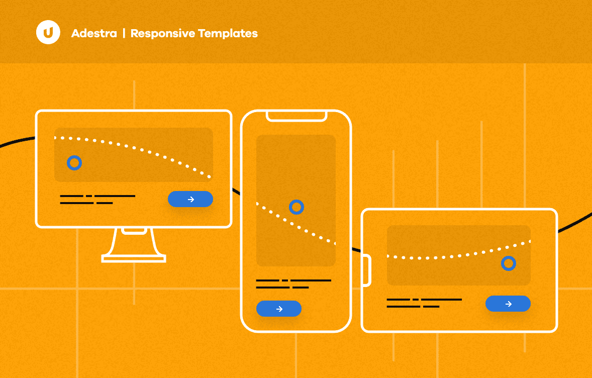
If you don’t have the time or resources to dive into responsive design yourself, not to worry! The internet is filled with near-infinite responsive email templates. In fact, you don’t even have to venture out into the rest of the internet for a responsive newsletter template — here’s one to start.
Use responsive email design to build a better experience.
Like the email marketing process itself, it’s easy to start out with basic media queries, but mastery of responsive design takes a bit more effort. Ideally, responsive design isn’t just about squeezing your content into a smaller screen. It’s about optimizing that content for the mobile experience.
For instance, this NFL newsletter spotlighted in our Best Email Ever! series (seen above) shows how email developers can use responsive design to simplify things. The desktop version of their newsletter places a rich image next to each link. It looks great on desktop, but it would be pretty cramped on mobile.
Some developers might solve this by collapsing the content into a single column (totally fine, by the way!), but this email does something a little different. When a reader loads this email on a small screen, the email’s media queries hide those extra images completely. That way, mobile users only see the most important parts of the email, ensuring the optimal mobile experience.
In short, when you’re building responsive email, the NFL’s email marketing efforts show that you can go one step further that just shuffling content around. This newsletter asks a more important question: do mobile readers really need to see that extra content? As great as your action shot of Drew Brees is, the answer is probably no.
Maybe even think about mobile-first design?
Now that 54% percent of emails are opened on mobile, there’s been a shift in how email marketers approach the creation mobile email. Developers and designers aren’t just building mobile versions of emails that were designed for desktop. They’re building emails for the mobile experience first.
Instead of basically building a desktop version and a mobile version, mobile-first means building just one. That way, you don’t have to bend over backwards to rework your email, when the majority of your audience will view that second version anyway.
By emphasizing the principles of mobile-first design, you might also provide a better experience for your desktop users. Make a clean and concise email for your mobile users, and you end up making a clean and concise email for everyone.
Most of your opens will occur on mobile. Are your newsletters ready?
However you approach your mobile newsletter strategy, leaving out your mobile users is no longer an option. If your email newsletters aren’t cutting it on mobile devices, they might as well be oldsletters.
Ready to start sending responsive email? Download a free responsive newsletter template here.